
Crafting Stunning UIs with PrimeVue v4 (Vue 3 + Vite Guide)

PrimeVue gives Vue 3 a large, accessible component set: data tables, forms, overlays, menus, and around ninety components you would otherwise build by hand. Version 4 changed how theming works, moving from prebuilt CSS theme files to a design-token system with swappable presets, so older setup guides no longer match what you install today.
This guide covers the current path (as of 2026): installing PrimeVue v4 in a Vue 3 + Vite project, registering the plugin, and choosing between styled mode (a polished preset out of the box) and unstyled mode (your own look, usually with Tailwind).
What is PrimeVue

PrimeVue is a UI component library built specifically for Vue.js. Offering more than 90+ components, PrimeVue covers all aspects of frontend development—forms, data presentation, navigation, and more. Each component is highly customizable, allowing developers to meet complex UI requirements with minimal effort. What sets PrimeVue apart is its rich set of features combined with a minimal footprint, making it ideal for Vue.js and Nuxt.js applications focused on both aesthetics and performance.
The real strength of PrimeVue lies in its flexibility. Whether you’re building a simple static website or a large-scale web application, PrimeVue gives you the tools to create professional-grade UIs with ease.
While PrimeVue offers a rich set of components, developers may also explore other UI libraries like Vuetify and Daisy UI for their unique features and design paradigms.
Why Use PrimeVue for UI Development?

PrimeVue is rapidly gaining popularity among developers aiming to accelerate their development workflows. But with so many UI component libraries available, why should developers choose PrimeVue? The answer lies in its rich feature set and the following benefits:
- Comprehensive Component Library: From form inputs and buttons to complex data tables and charts, PrimeVue covers all aspects of UI development.
- Ease of Customization: Components are highly customizable and come with various props, events, and slots to tweak their behavior.
- Figma UI Kit: PrimeOne for Figma uses the latest powerful features like components, variants, auto layout, styles and interactive components.
- Responsive Design: PrimeVue components are mobile-ready and fully responsive, out of the box.
- AI Ready: Give compatible AI assistants access to PrimeVue component documentation, guides, examples, and API metadata with the official MCP server or install the official plugin for added skills.
- Extensible and Modular: You can include only the components you need, making it highly efficient for performance-sensitive applications.
- Beautiful and Customizable Icons: PrimeIcons is the default icon library for PrimeVue, offering over 250 open-source icons. It's optional, as PrimeVue components can use any icons with templating.
- Community and Documentation: PrimeVue boasts a thriving community and detailed documentation, making it easy to get started and troubleshoot any issues.
These features make PrimeVue a powerful choice for any Vue.js or Nuxt.js project, regardless of scale or complexity.
If you’re considering other libraries for your Vue.js project, you might find that solutions like Shadcn Vue offer specific advantages for building modern interfaces. For a deeper dive into these benefits, check out this Shadcn Vue article.
Getting Started With PrimeVue
PrimeVue works great with both Vue.js 3 and Nuxt 3 apps. In this section, we will walk you through installing and activating PrimeVue in both apps.
Installation with Vue 3 & Vite
First we install the library, it’s themes, and related icons to the project.
npm install primevue @primevue/themes primeiconsNext, register the plugin, we’ll start out using the theme Aura (more on styling later).
import { createApp } from 'vue'
import PrimeVue from 'primevue/config'
import Aura from '@primevue/themes/aura'
import App from './App.vue'

const app = createApp(App)

app.use(PrimeVue, {
  theme: {
    preset: Aura,
  }
})

app.mount('#app')
Finally, test things about by using a button component wherever you’d like.
<script>
import Button from 'primevue/button'
</script>

<template>
 <Button>Submit</Button>
</template>
For larger apps, register on demand with the auto-import resolver (@primevue/auto-import-resolver) instead of importing each component by hand.
Installation with Nuxt 3
Nuxt.js simplifies the process of building server-side rendered and static sites using Vue.js. Integrating PrimeVue with Nuxt adds another layer of flexibility and performance. If you don’t already have a Nuxt 3 app, use the following command to create one:
npx nuxi@latest init primevue-nuxt-appNext, we need to install PrimeVue and also the PrimeVue Nuxt module.
npm install primevue @primeuix/themes
npm install --save-dev @primevue/nuxt-module
In nuxt.config file, add the @primevue/nuxt-module to the modules section and define primevue object for the configuration of the module.
export default defineNuxtConfig({
    modules: [
        '@primevue/nuxt-module'
    ],
    primevue: {
        /* Configuration */
    }
})
Customizing PrimeVue Components with Props
PrimeVue gives us the ability to customize components through various props, to tailor them to fit the specific needs of our application. A great example of this is the ToggleButton, which provides an intuitive way to select a boolean value.
Basic Usage
The ToggleButton can be easily integrated into your Vue application with two-way binding using the standard v-model directive. This allows you to bind it to a boolean property, making it straightforward to track its state.
<script setup>
import { ref } from 'vue'
import ToggleButton from 'primevue/togglebutton'

const isChecked = ref(false)
</script>

<template>
  <div>
    <ToggleButton v-model="isChecked" onLabel="On" offLabel="Off" />
  </div>
</template>
In this basic setup, the button displays "On" when the value is true and "Off" when it's false.

Customized Options
Beyond the basic usage, the ToggleButton can be extensively customized. You can modify the labels and icons that represent the button’s states using the onLabel and offLabel props and component slots. This not only enhances the user experience but also aligns the component's appearance with your application's design language.
Here’s how you can implement a customized ToggleButton:
<script setup>
import { ref } from 'vue'
import Lock from '@primeicons/vue/lock';
import LockOpen from '@primeicons/vue/lock-open';

const isChecked = ref(false)
</script>

<template>
<ToggleButton v-model="isChecked" onLabel="Locked" offLabel="Unlocked">
    <template #icon="{ value }">
        <Lock v-if="value" />
        <LockOpen v-else />
  </template>
</ToggleButton>
</template>
With that in place, this is how the ToggleButton will look now:

We’ll talk more in a bit about how to get those icon components installed and setup.
Prime Vue Style Modes and Themes
One of the standout features of PrimeVue is its flexibility in how you can style components, thanks to its 2 main styling modes: Styled and Unstyled. This allows developers to either hit the ground running with pre-designed themes or take full control by custom styling every aspect of the UI.
Styled Mode
In Styled Mode, PrimeVue components come with predefined skins, making it easier to get started with polished UI elements without having to worry about custom CSS.
Styled mode is ideal for projects where you need a fully-functional and visually appealing UI with minimal setup. You can focus on building your application rather than spending time designing each component from scratch.
Themes ship in a separate npm package from the core library (@primeuix/themes) but we’ve already installed them.
There are 4 themes available: Aura, Material, Lara, or Nora. You can use any of them out of the box as is.
import Aura from '@primevue/themes/aura'
//...
app.use(PrimeVue, {
  theme: {
    preset: Aura,
  }
})
Or you can customize an existing theme with definePreset
import Aura from '@primeuix/themes/aura';
const MyPreset = definePreset(Aura, {
    //Your customizations here
});
app.use(PrimeVue, {
    theme: {
        preset: MyPreset
    }
});
Each preset is built from three token tiers, primitive tokens (raw color and spacing scales), semantic tokens (roles like primary and surface), and component tokens (per-component values). These are what you are overriding in your custom presets.
For example, you could override the theme primary color
const MyPreset = definePreset(Aura, {
    semantic: {
        primary: {
            50: '{indigo.50}',
            100: '{indigo.100}',
            200: '{indigo.200}',
            300: '{indigo.300}',
            400: '{indigo.400}',
            500: '{indigo.500}',
            600: '{indigo.600}',
            700: '{indigo.700}',
            800: '{indigo.800}',
            900: '{indigo.900}',
            950: '{indigo.950}'
        }
    }
});
If you enjoy the Tailwind CSS utility class approach, install **tailwindcss-primeui .** It pairs nicely with existing themes and provides extra Tailwind-like utility classes for theme design tokens like: bg-primary, text-surface-500, and text-muted-color.
View the full instructions on setting up Tailwind CSS with Prime Vue in the official documenation.
Prime Vue Dark Mode
Each theme ships with support for dark mode out of the box. The preference defaults to using system preference, but you can override with a custom css selector.
app.use(PrimeVue, {
  theme: {
    preset: Aura,
    options: {
      darkModeSelector: '.my-app-dark'
    }
  }
})
In this configuration, PrimeVue will toggle its theme based on the presence of the .my-app-dark class, giving you control over how dark mode is applied in your app.
Unstyled Mode
For developers who prefer complete control over the design, Unstyled Mode is an excellent option. In this mode, PrimeVue components don’t come with any CSS by default, allowing you to style them from the ground up. This mode is particularly useful if you’re building a custom UI library on top of PrimeVue or if you need to adhere to specific design systems.
To activate unstyled mode, pass the unstyled: true option when setting up PrimeVue:
const app = createApp(App);
app.use(PrimeVue, {
    unstyled: true
});
app.mount('#app');
In this setup, all PrimeVue components will be rendered without any default styles, leaving it up to you to design and apply your custom styles.
Even when using a theme, you can enable unstyled mode per component with a prop.
<Button unstyled>Submit</Button>This approach pairs nicely with the same Tailwind CSS setup we discussed earlier using pass through attributes (pt:).
<template>
    <Button unstyled pt:root="bg-teal-500 hover:bg-teal-700 active:bg-teal-900 cursor-pointer py-2 px-4 rounded-full border-0 flex items-center gap-2">
        <span class="text-white font-bold text-lg">Search</span>
    </Button>
</template>
Or you can set the pass through attributes at the global level (while still allowing local overrides via the pt: attributes)
import { createApp } from "vue";
import PrimeVue from "primevue/config";
const app = createApp(App);
app.use(PrimeVue, {
    unstyled: true,
    pt: {
        button: {
            root: 'bg-teal-500 hover:bg-teal-700 active:bg-teal-900 cursor-pointer py-2 px-4 rounded-full border-0 flex gap-2',
            label: 'text-white font-bold text-lg',
            icon: 'text-white text-xl'
        },
        panel: {
            header: 'bg-primary text-primary-contrast border-primary',
            content: 'border-primary text-lg text-primary-700',
            title: 'bg-primary text-primary-contrast text-xl',
            pcToggleButton: {
                root: 'bg-primary text-primary-contrast hover:text-primary hover:bg-primary-contrast'
            }
        }
    }
});
Premium Prime Vue Templates
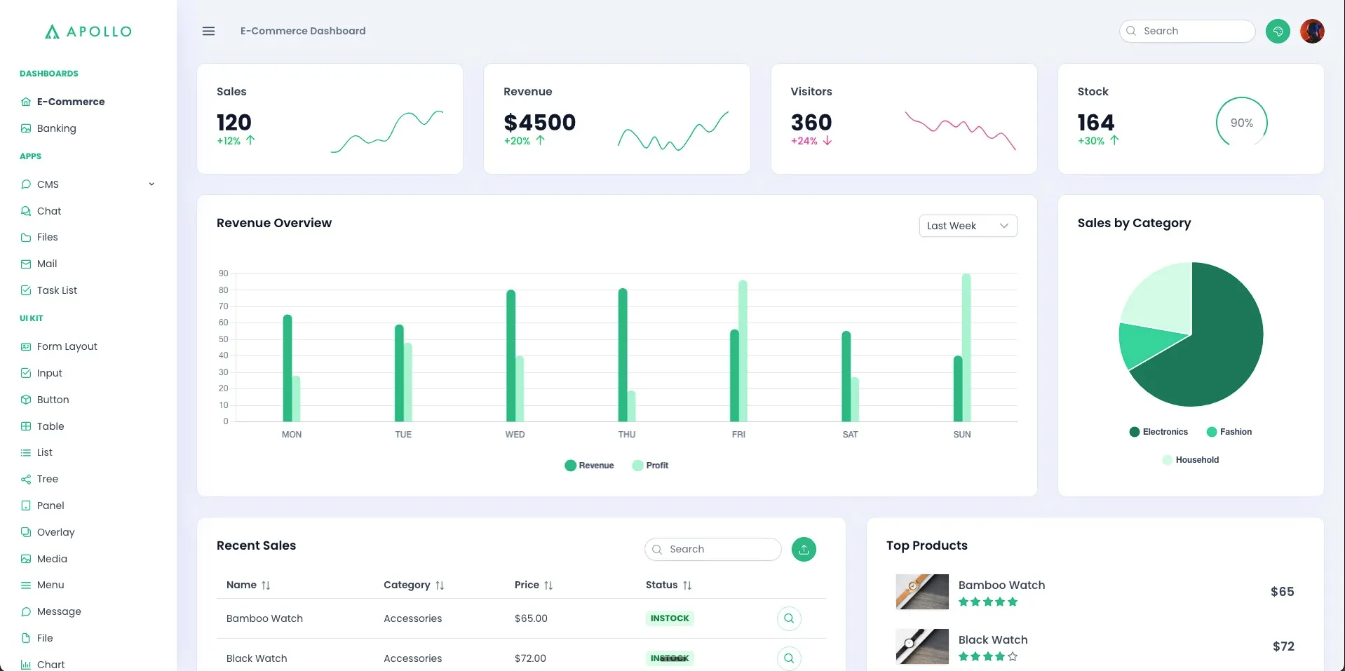
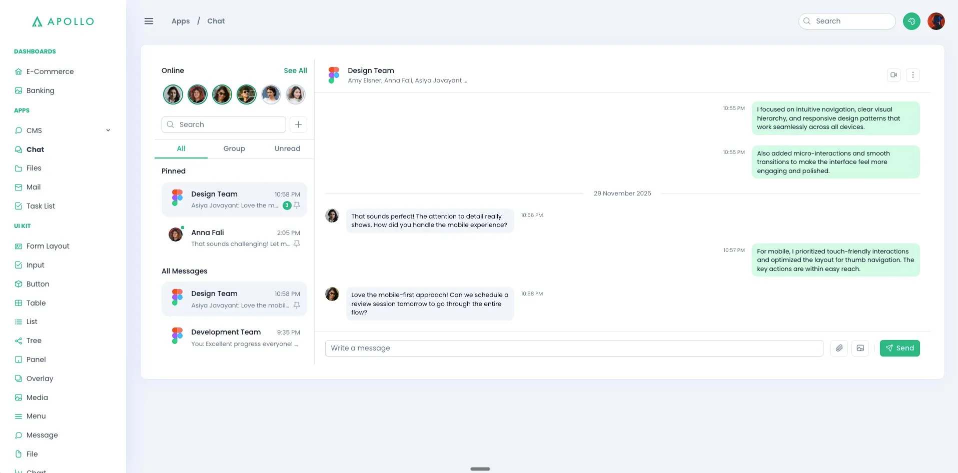
For the ultimate out of the box experience, official templates are also available for purchase. They provide full screens composed of PrimeVue components for common application needs.
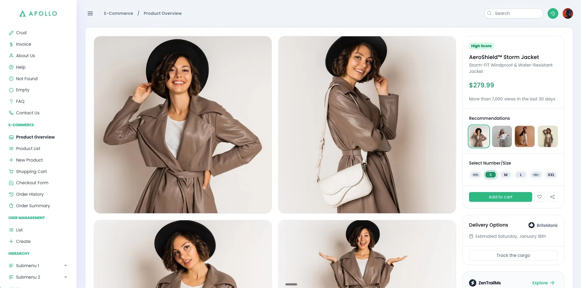
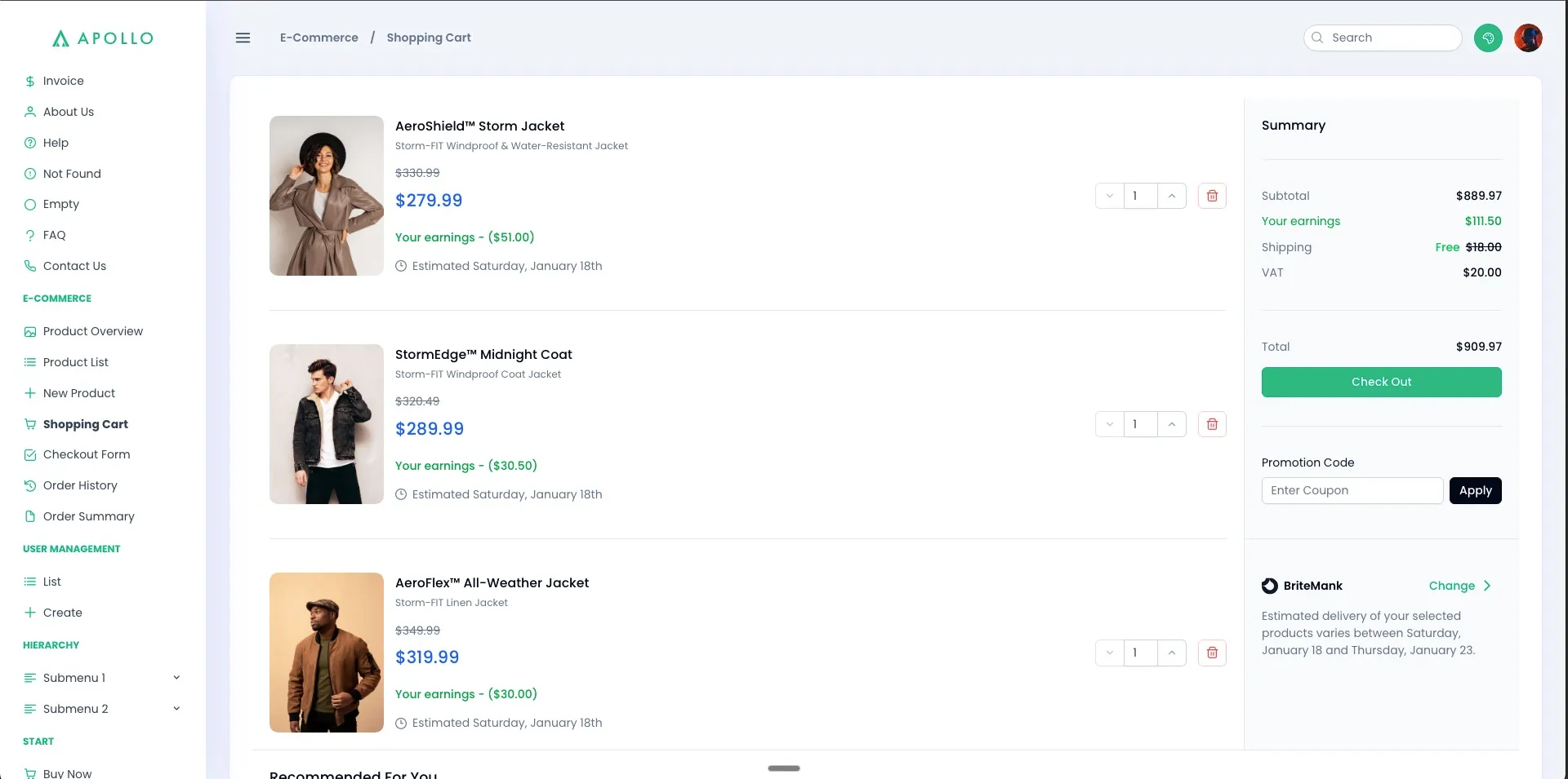
The Apollo template, for example, gives you:
- A dashboard screen
- Chat
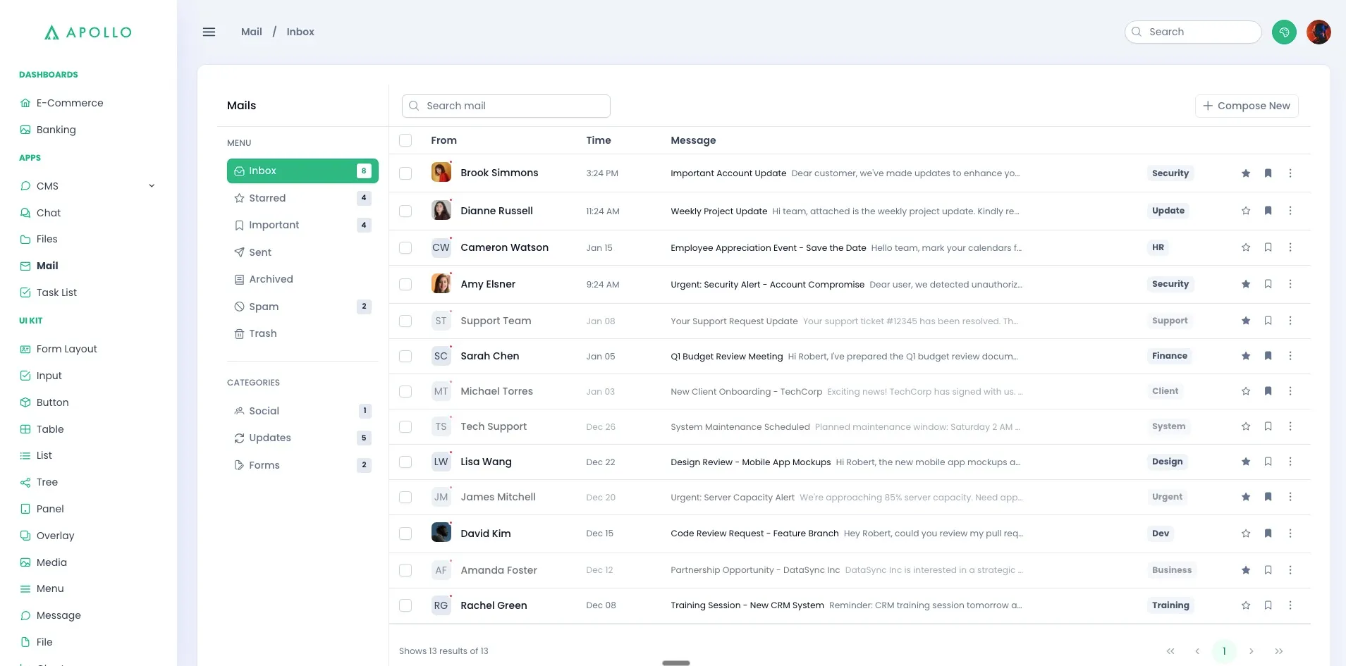
- Ecommerce
- Auth
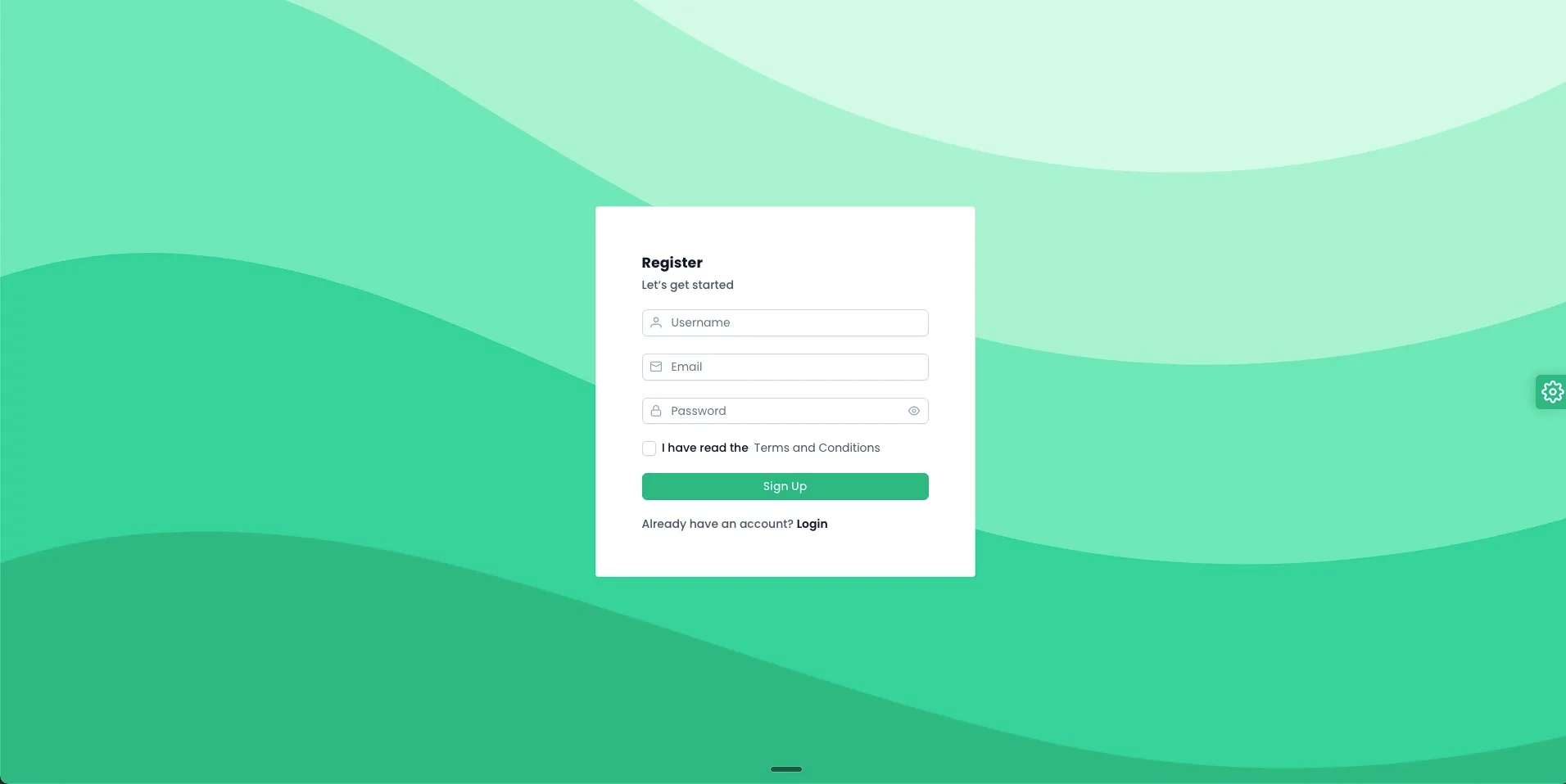
And many more. View the complete Apollo demo for more info.
Prime Vue Components RoundUp
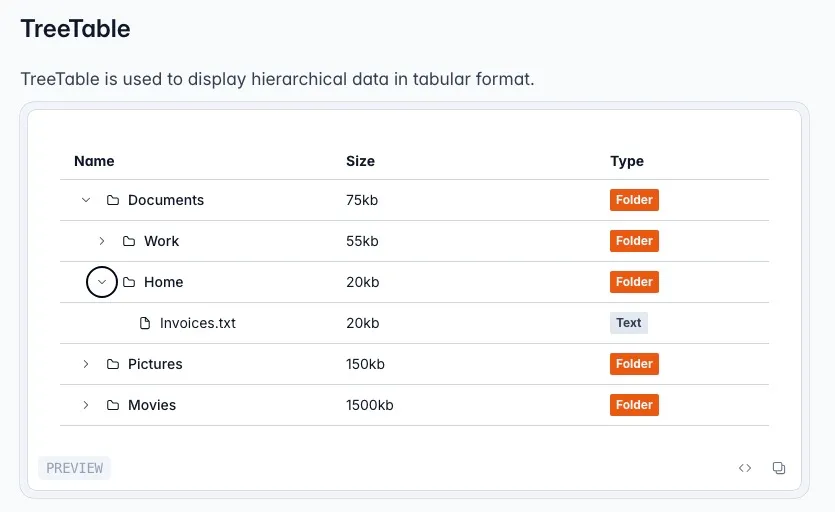
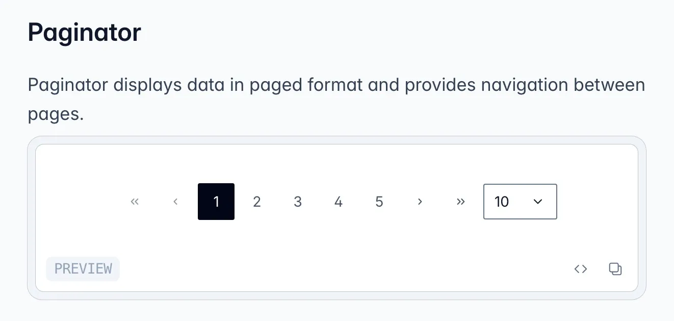
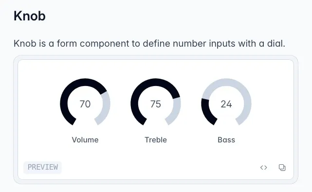
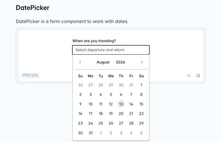
Prime Vue’s 90+ components boast an impressive lineup of common and unique UI elements. Included in the package are:
- Data tables - for highly functional tabular data with sorting, filtering, virtual scrolling, empty states, and more
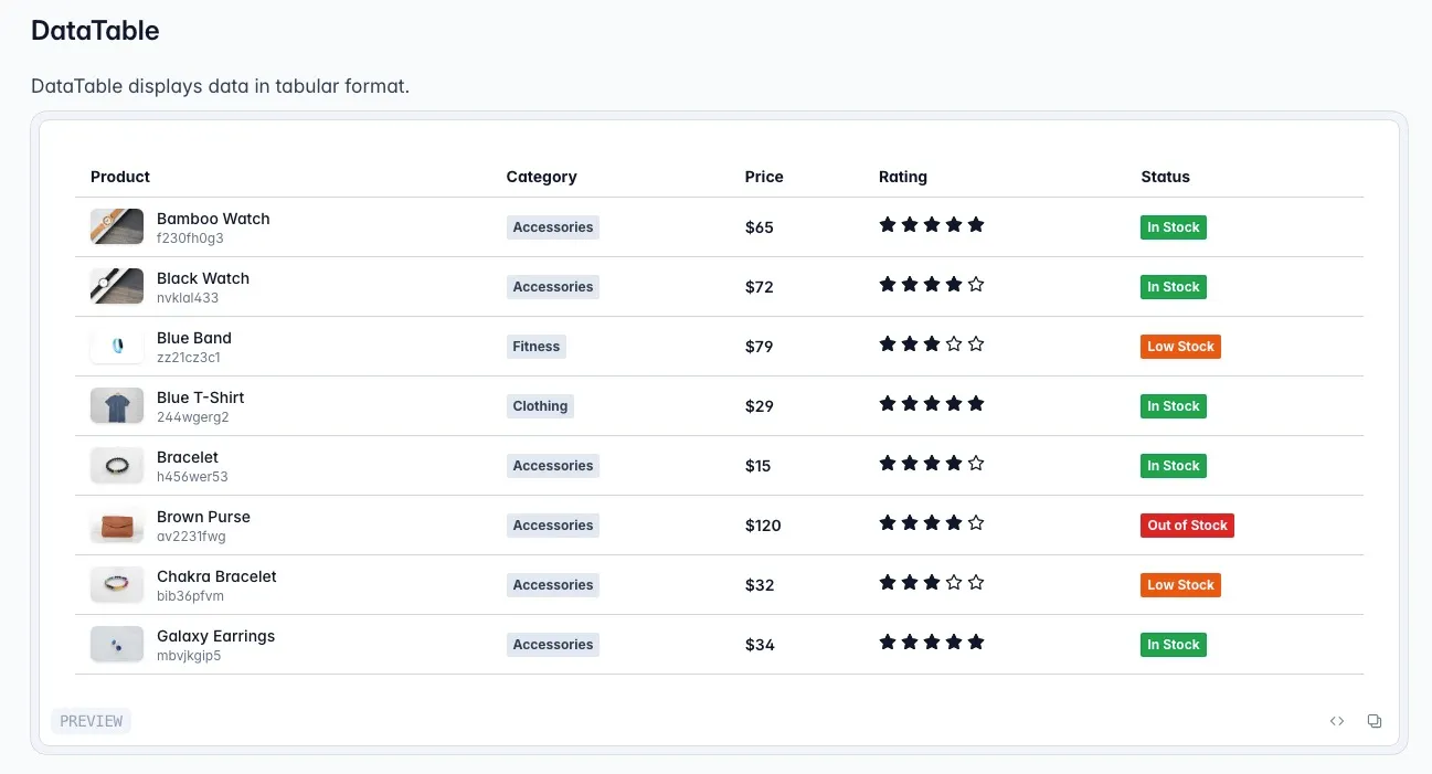
- Tree Tables - used to display hierarchical data in tabular format.
- Pagination
- Knobs
- DatePicker
- Carousel
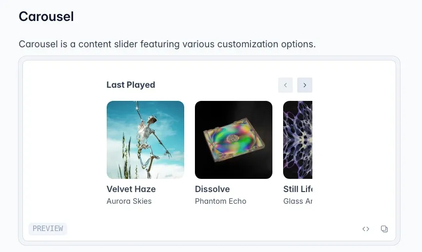
- Plus many more. See the full list of components on the PrimeVue website.
PrimeIcons: Flexible Icon Integration with PrimeVue
Primeicons is the official icon library for PrimeVue, featuring over 300 open-source icons. It provides a wide range of icons designed to integrate seamlessly with PrimeVue components. While PrimeIcons is optional (since you can use any custom icon set), its flexibility and ease of use make it a convenient choice for most Vue.js projects.
Downloading PrimeIcons
To get started, install the PrimeIcons package via npm:
npm install @primeicons/vueThis will add the PrimeIcons library to your project. Import them individually for optimal tree-shaking.
<script setup>
import Check from '@primeicons/vue/check';
import Times from '@primeicons/vue/times';
import Search from '@primeicons/vue/search';
import User from '@primeicons/vue/user';
</script>
<template>
    <Check />
    <Times />
    <Search />
    <User />
</template>
The above code results in the following output:

Customizing and Extending PrimeIcons
If you need to customize the icons colors, size, or animation, that’s all possible via props.
<Cog color="green" spin :size="32" />When to choose PrimeVue vs other Vue UI libraries
By now, it’s clear PrimeVue is a feature rich project. But there are other great alternatives out there. Use this chart to help you decide.
| Library | Components | Styling model | Best for |
|---|---|---|---|
| PrimeVue v4 | ~90, incl. DataTable | Styled presets + unstyled (Tailwind via pass-through) | Data-heavy admin and enterprise apps that need breadth and theming flexibility |
| Vuetify | 100+ | Material Design (opinionated) | Teams that want Material Design out of the box |
| Quasar | 90+ | Own design + Quasar CLI | One codebase across SPA, SSR, PWA, mobile, and desktop |
| Element Plus | 80+ | Own desktop-oriented design | Admin dashboards with a desktop feel |
| Nuxt UI | 125+ | Tailwind + Reka UI (headless) | Nuxt and Tailwind teams wanting accessible, composable components (also works with vanilla Vue) |
| **Reka UI (headless)** | 40+ Component Primitives | Unstyled | Bespoke design systems that need full styling control |
| ShadCN Vue | 70+ | Styled and copied to your project source code for complete customizability | Great visual defaults with easy customization |
- Reach for PrimeVue when you need a very large component set (especially DataTable and rich form inputs) and want the option to either ship a polished preset or go fully unstyled with Tailwind. That mix of breadth plus theming freedom is its edge.
- Prefer Vuetify if you want Material Design out of the box with few styling decisions.
- Prefer Quasar if you want one codebase to target web, mobile, and desktop and want a Vue School course to walk you through it.
- Prefer Nuxt UI if you are all in on Nuxt and Tailwind and want accessible, headless-based components and want a Vue School course to walk you through it.
- Reach for a headless library like Reka UI if you are building a bespoke design system and want to own every pixel while shipping accessible and highly functional UIs.
- Go for ShadCN Vue if you like the approach of components as project source code instead of dependencies in the node_modules directory. Our course can walk you through how it works.
PrimeVue Frequently Asked Questions (FAQ)
Does PrimeVue work with Vue 3?
Yes. PrimeVue v4 targets Vue 3 and the Composition API. Install primevue and @primevue/themes, register the plugin, and pick a preset.
Is PrimeVue free?
Yes. The component library is open source under the MIT license. Prime sells optional paid templates and UI kits, but the components themselves are free.
How do I change the theme in PrimeVue v4?
Choose a preset (Aura, Material, Lara, or Nora) in the plugin config, then customize it with design tokens through definePreset. The old v3 approach of importing a theme CSS file is gone.
Can I use PrimeVue with Tailwind?
Yes. Use unstyled mode with the Pass Through (pt) props or global pass through config, and add the tailwindcss-primeui plugin so PrimeVue and Tailwind share the same semantic tokens.
Does PrimeVue support dark mode?
Yes. Set darkModeSelector in the theme options and toggle that class on a root element. No second theme file required.
PrimeVue or Vuetify?
Pick PrimeVue for a very large component set and the freedom to go styled or unstyled with Tailwind. Pick Vuetify if you want Material Design out of the box with minimal styling decisions.
Conclusion
As we've explored, PrimeVue stands out as an exceptional framework for building stunning user interfaces in Vue.js applications. Its extensive collection of components, flexibility, and ease of integration make it a powerful choice for developers aiming to create responsive and visually appealing UIs.
However, the world of UI libraries is vast, and there’s always more to discover. If you’re interested in broadening your skill set and diving deeper into custom solutions, I encourage you to check out the article on crafting a custom component library with Vue and Daisy UI. This resource will equip you with the knowledge to create tailored components that perfectly fit your project requirements.
By leveraging the strengths of various libraries and frameworks, you can enhance your development toolkit and deliver even more impressive user experiences. And if you are brand new to Vue.js our flagship master class is a great place to start before adopting PrimeVue in your next project.
Yes. PrimeVue v4 targets Vue 3 and the Composition API. Install primevue
and @primevue/themes, register the plugin, and pick a preset.
Yes. The component library is open source under the MIT license. Prime sells optional paid templates and UI kits, but the components themselves are free. Verify the current license note before publishing.
Choose a preset (Aura, Material, Lara, or Nora) in the plugin config, then customize it with design tokens through
Yes. Use unstyled mode with the Pass Through (pt) props, and add the tailwindcss-primeui plugin so PrimeVue and Tailwind share the same semantic tokens.
Yes. Set darkModeSelector in the theme options and toggle that class on a root element. No second theme file required.
Pick PrimeVue for a very large component set and the freedom to go styled or unstyled with Tailwind. Pick Vuetify if you want Material Design out of the box with minimal styling decisions.
Start learning Vue.js for free

Comments
Latest Vue School Articles

5 Component Design Patterns to Boost Your Vue.js Applications


Vibe Coding a Collaborative Editor with Comment Support with Nuxt UI and Jazz
Our goal is to be the number one source of Vue.js knowledge for all skill levels. We offer the knowledge of our industry leaders through awesome video courses for a ridiculously low price.
More than 250.000 users have already joined us. You are welcome too!
© All rights reserved. Made with ❤️ by BitterBrains, Inc.