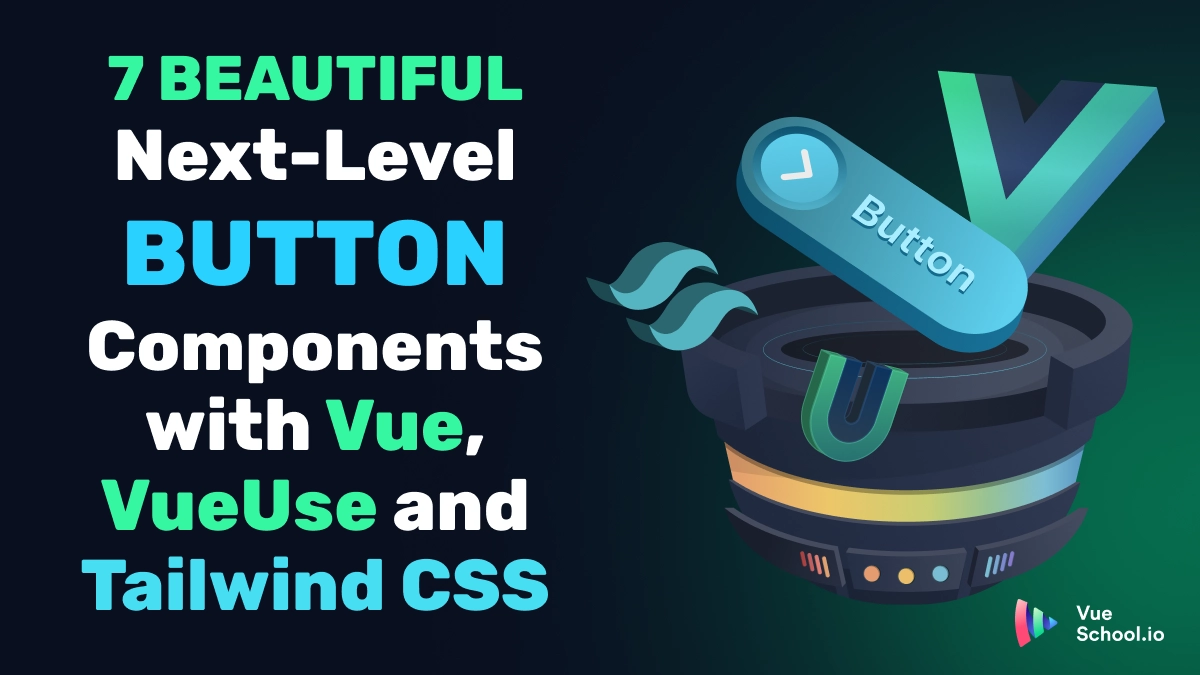
7 Beautiful Next-Level Button Components with Vue, VueUse, and TailwindCSS

Buttons are everywhere and you can style them ALL kinds of ways with plain CSS. But sometimes it’s helpful to bring a little JavaScript into the mix. In this article, let’s take a look at 7 different button designs that are both practical and look great! Most importantly let’s see how we can implement them with Vue, VueUse, TailwindCSS.
TLDR:
Checkout this StackBlitz project to try out the different buttons and grab the code for the ones you like!
A Button With Loading State
Often times clicking a button means submitting or fetching data from a server. In such cases, having a loading state on the button is a great way to provide user feedback.

We can make this easily, with a Vue component and a simple SVG.
<!--AppButton.vue-->
<script setup lang="ts">
import { defineProps } from 'vue'

const props = defineProps<{
  loading?: boolean
  label?: string
}>()
</script>

<template>

    <!-- Disable the button when loading to prevent extraneous requests-->
  <button
    :class="[
      'px-4 py-2 rounded-md font-semibold text-white transition-colors duration-300',
      'flex items-center justify-center min-w-[120px]',
      props.loading ? 'bg-blue-400 cursor-not-allowed' : 'bg-blue-600 hover:bg-blue-700',
    ]"
    :disabled="props.loading"
  >
      <!-- Show the loading indicator only when loading is truthy -->
    <span
      v-if="props.loading"
      class="mr-2"
    >
      <svg
        class="animate-spin h-5 w-5 text-white"
        xmlns="http://www.w3.org/2000/svg"
        fill="none"
        viewBox="0 0 24 24"
      >
        <circle
          class="opacity-25"
          cx="12"
          cy="12"
          r="10"
          stroke="currentColor"
          stroke-width="4"
        />
        <path
          class="opacity-75"
          fill="currentColor"
          d="M4 12a8 8 0 018-8V0C5.373 0 0 5.373 0 12h4zm2 5.291A7.962 7.962 0 014 12H0c0 3.042 1.135 5.824 3 7.938l3-2.647z"
        />
      </svg>
    </span>
    <span>
      <slot>{{ props.label }}</slot>
    </span>
  </button>
</template>
Button with Progress State
Similarly to a button with loading state, sometimes we’ve able to show progress as a fraction of 100%. When this info is available is great to give the user this incremental feedback so they get a feel for how much time is left to complete the task at hand.
We can handle this no problem by positioning an inner span tag with the Tailwind classes absolute and inset-0. Then we dynamically set the width based on a progress prop. The VueUse refAutoReset function also makes it super easy to show a completed message for x seconds after 100% is reached. Transition between the messages is a breeze with Vue’s built in transition component.

<!-- ProgressButton-->
<script setup lang="ts">
import { defineProps } from 'vue'

const done = refAutoReset(false, 3000)

const props = defineProps<{
  label?: string
  progress?: number
  completeMsg?: string
}>()

watch(() => props.progress, (progress) => {
  if (Number(progress) >= 100) {
    done.value = true
  }
})
</script>

<template>
  <button
    :class="[
      'px-4 py-2 rounded-md font-semibold text-white transition-colors duration-300 relative',
      'flex items-center justify-center min-w-[120px]',
      'bg-blue-600 hover:bg-blue-700 overflow-hidden',
    ]"
    :disabled="Number(progress) >= 100"
  >
    <span
      class="inline-block bg-blue-800 absolute inset-0"
      :style="{
        width: `${props.progress}%`,
      }"
    />
    <Transition mode="out-in">
      <span
        v-if="!done"
        class="z-10"
      >
        <slot>{{ props.label }}</slot>
      </span>

      <span
        v-else
        class="z-10"
      >
        {{ props.completeMsg || 'Completed!' }}
      </span>
    </Transition>
  </button>
</template>

<style scoped>
.v-enter-active,
.v-leave-active {
  transition: transform 0.5s;
}

.v-enter-from {
  transform: translateY(-120%);
}

.v-leave-to {
  transform: translateY(120%);
}
</style>
Glow Button
Everybody loves shiny things! So why not make your buttons shiny? Combine the VueUse usePointer composable with a span positioned absolutely with TailwindCSS and a few custom styles to keep the shine following the pointer.

<!-- GlowButton-->
<script setup>
import { defineProps } from 'vue'

const btnEl = useTemplateRef('btn')

const hovering = ref(false)

const { x, y } = usePointer({
  target: btnEl,
})

const props = defineProps({
  label: {
    type: String,
    default: 'Button',
  },
})
</script>

<template>
  <button
    ref="btn"
    :class="[
      'px-4 py-2 rounded-md font-semibold text-white transition-colors duration-300 relative inline-block',
      'flex items-center justify-center min-w-[120px] overflow-hidden',
      props.loading ? 'bg-blue-400 cursor-not-allowed' : 'bg-blue-600 hover:bg-blue-700',
    ]"
    @mouseenter="hovering = true"
    @mouseleave="hovering = false"
  >
    <span
      v-if="hovering"
      class=" absolute inline-block rounded-full h-[1px] w-[1px]"
      :style="{
        left: `${x - btnEl?.offsetLeft}px`,
        top: `${y - btnEl?.offsetTop}px`,
        boxShadow: `0 0 30px 0.7rem rgba(255, 255, 255, 1)`,
        background: 'rgba(255, 255, 255, 0.55)',
      }"
    />

    <span>

      <slot>{{ props.label }}</slot>
    </span>
  </button>
</template>
Glow Outline Button
Maybe the full glow isn’t quite what you’re going for. This glow outline is a little classier and subtle and looks great! It’s achieved in an almost identical fashion to the glow button except that the outline is faked by a containing element with some padding, the element with the button background is nested inside this outline and it sits on top of the shine. This makes the shine appear only on the “outline”.

Spotlight Button
Another effect that uses the same technique as those above but adds another element into the mix, is the spotlight effect. This uses 2 spans instead of 1, positioning one of them to follow the mouse and the other to do the opposite.

<!-- SpotlightButton.vue-->

<script setup>
import { ref, computed } from 'vue'

const btnEl = ref(null)

const hovering = ref(false)

const mousePos = ref({ x: 0, y: 0 })

const props = defineProps({
  label: {
    type: String,
    default: 'Button',
  },
  loading: {
    type: Boolean,
    default: false,
  },
})

const updateMousePosition = (event) => {
  if (btnEl.value) {
    const rect = btnEl.value.getBoundingClientRect()
    mousePos.value = {
      x: event.clientX - rect.left,
      y: event.clientY - rect.top,
    }
  }
}

const spotlight1Style = computed(() => ({
  left: `${mousePos.value.x}px`,
  top: `${mousePos.value.y}px`,
  background: 'radial-gradient(circle, rgba(255,255,255,0.2) 0%, rgba(255,255,255,0) 70%)',
  boxShadow: '0 0 15px 5px rgba(255,255,255,0.1)',
  transform: 'translate(-50%, -50%) scale(1.2)',
}))

const spotlight2Style = computed(() => ({
  left: `${btnEl.value ? btnEl.value.offsetWidth - mousePos.value.x : 0}px`,
  top: `${btnEl.value ? btnEl.value.offsetHeight - mousePos.value.y : 0}px`,
  background: 'radial-gradient(circle, rgba(255,255,255,0.15) 0%, rgba(255,255,255,0) 70%)',
  boxShadow: '0 0 15px 5px rgba(255,255,255,0.08)',
  transform: 'translate(-50%, -50%) scale(0.8)',
}))
</script>

<template>
  <button
    ref="btnEl"
    :class="[
      'px-4 py-2 rounded-md font-semibold text-white transition-colors duration-300 relative inline-block',
      'flex items-center justify-center min-w-[120px] overflow-hidden',
      props.loading ? 'bg-blue-400 cursor-not-allowed' : 'bg-blue-600 hover:bg-blue-700',
    ]"
    @mouseenter="hovering = true"
    @mouseleave="hovering = false"
    @mousemove="updateMousePosition"
  >
    <span
      v-if="hovering"
      class="absolute inline-block rounded-full h-20 w-20 pointer-events-none"
      :style="spotlight1Style"
    />
    <span
      v-if="hovering"
      class="absolute inline-block rounded-full h-16 w-16 pointer-events-none"
      :style="spotlight2Style"
    />
    <span class="relative z-10">
      <slot>{{ props.label }}</slot>
    </span>
  </button>
</template>
Material Button
This next effect is one you’re probably quite familiar with. It simulates the “Material Design” created and popularized by Google. You could download Vuetify to achieve a similar look on buttons and more, but if you want a simple solution only for buttons, grab the code snippet below.
Once again, it’s based off of the mouse position but instead of following the mouse continually, it checks the mouse position at the time of click and then places a span at the spot. It also uses a native CSS animation to create the expand affect after click.

<!-- MaterialButton-->
<script setup lang="ts">
import { defineProps } from 'vue'

const props = defineProps<{
  loading?: boolean
  label?: string
}>()

const btnEl = useTemplateRef('btnEl')
const { x, y } = usePointer()
const clicked = refAutoReset({ x: 0, y: 0 }, 500)
</script>

<template>
  <button
    ref="btnEl"
    :class="[
      'px-4 py-2 rounded-md font-semibold text-white transition-colors duration-300',
      'flex items-center justify-center min-w-[120px] overflow-hidden relative',
      'bg-blue-600 hover:bg-blue-700',
    ]"
    @click="clicked = { x: x - (btnEl?.offsetLeft || 0), y: y - (btnEl?.offsetTop || 0) }"
  >
    <span
      v-if="clicked.x && clicked.y"

      class="bg-black opacity-20 expand rounded-full w-5 h-5 absolute"
      :style="{ top: `${clicked.y}px`, left: `${clicked.x}px` }"
    />
    <span>
      <slot>{{ props.label }}</slot>
    </span>
  </button>
</template>

<style scoped>
@keyframes expand{
    from{
        transform: scale(0);
        opacity:.5;
    }
    to{
        transform: scale(5);
        opacity: 0;
    }
}

.expand{
    animation: expand 0.5s ease-out;
}
</style>
Cursor Expand Button
This final button is combined with a custom cursor, marrying the relationship of cursor and button nicely when you hover the button. It takes advantage of Vue’s built in provide/inject functionality to share button state from the button to the cursor and visa-versa so that it can expand to fit the button width and height on hover.

<!--CustomCursor.vue-->
<script setup lang="ts">
const { x, y } = usePointer()
const el = useTemplateRef('el')

const hoveringBtnData = ref({ width: 0, height: 0, hovering: false, topOffset: 0, leftOffset: 0 })
const hoveringBtnDataDebounced = refDebounced(hoveringBtnData, 400)

provide(customCursorKey, {
  setHoveringBtnData: (data: { width: number, height: number, hovering: boolean }) => {
    hoveringBtnData.value = data
  },
  provided: true,
})

const style = computed(() => {
  if (!hoveringBtnData.value.hovering) {
    return {
      top: `${y.value - ((el.value?.clientHeight || 0) / 2)}px`,
      left: `${x.value - ((el.value?.clientWidth || 0) / 2)}px`,
    }
  }
  return {
    top: `${hoveringBtnData.value?.topOffset - 2}px`,
    left: `${hoveringBtnData.value?.leftOffset - 2}px`,
    width: `${hoveringBtnData.value?.width + 4}px`,
    height: `${hoveringBtnData.value?.height + 4}px`,
  }
})

onMounted(() => {
  document.body.classList.add('cursor-none')
})
onUnmounted(() => {
  document.body.classList.remove('cursor-none')
})
</script>

<script lang="ts">
export const customCursorKey = Symbol() as InjectionKey<{
  setHoveringBtnData: (data: { width: number, height: number, hovering: boolean, topOffset: number, leftOffset: number }) => void
  provided: boolean
}>
</script>

<template>
  <div>
    <slot />
    <div
      ref="el"
      :style="style"
      class="custom-cursor bg-blue-500 rounded-md w-3 h-3 fixed border border-blue-600"
      :class="{ 'hovering-btn': hoveringBtnData.hovering || hoveringBtnDataDebounced.hovering }"
    />
  </div>
</template>

<style>
.custom-cursor.hovering-btn{
  transition: all 0.4s ease;
  transform-origin:center;
}
</style>
<!--Page.vue-->
<template>
  <div>
    <CustomCursor>
      <CursorExpandButton>
        Click Me
      </CursorExpandButton>
    </CustomCursor>
  </div>
</template>
<!-- CursorExpandButton.vue -->
<script setup lang="ts">
import { defineProps } from 'vue'
import { customCursorKey } from './CustomCursor.vue'

const btnEl = useTemplateRef('btn')

const { setHoveringBtnData, provided } = inject(customCursorKey, {
  provided: false,
  setHoveringBtnData: () => {},
})

if (!provided) {
  throw new Error('CustomCursorButton must be use in the context of CustomCursor')
}

const hovering = ref(false)

watch(hovering, (newVal) => {
  if (newVal) {
    setHoveringBtnData({
      width: btnEl.value?.clientWidth || 0,
      height: btnEl.value?.clientHeight || 0,
      topOffset: btnEl.value?.offsetTop || 0,
      leftOffset: btnEl.value?.offsetLeft || 0,
      hovering: true,
    })
  }
  else {
    setHoveringBtnData({
      width: 0,
      height: 0,
      hovering: false,
      topOffset: 0,
      leftOffset: 0,
    })
  }
})

const props = defineProps({
  label: {
    type: String,
    default: 'Button',
  },
})

let customCursor: HTMLSpanElement | null = null

onMounted(() => {
  customCursor = document.querySelector('.custom-cursor')
  if (!customCursor) {
    customCursor = document.createElement('span')
    customCursor.classList.add('custom-cursor')
    document.body.appendChild(customCursor)
  }
})
</script>

<template>
  <button
    ref="btn"
    class="overflow-hidden relative inline-block bg-blue-800 hover:bg-blue-900 p-[2px] rounded-md"

    @mouseenter="hovering = true"
    @mouseleave="hovering = false"
  >
    <span
      :class="[
        ' z-10 relative px-4 py-2 rounded-md font-semibold text-white transition-colors duration-300 inline-block',
        'flex items-center justify-center min-w-[120px] ',
      ]"
    >

      <span>
        <slot>{{ props.label }}</slot>
      </span>
    </span>
  </button>
</template>
Conclusion
CSS can go a long way when creating beautiful buttons but sometimes adding in a little JavaScript (especially paired with Vue.js) widen the creative and practical possibilities even more than CSS alone.
Start learning Vue.js for free

Comments
Latest Vue School Articles

Just Released: Nuxt Hub Multi-Vendor and First-Class DB

Vue.js – 2025 In Review and a Peek into 2026
Our goal is to be the number one source of Vue.js knowledge for all skill levels. We offer the knowledge of our industry leaders through awesome video courses for a ridiculously low price.
More than 200.000 users have already joined us. You are welcome too!
© All rights reserved. Made with ❤️ by BitterBrains, Inc.