
Building a Tag Input Component with the Vue 3 Composition API

Ever wonder how to build one of those fancy tag input components like you see in blog admin panels or in notion docs? Well, wonder no more! In this article we'll use Vue 3's composition API to make a reusable tag input component of our very own. Along the way we'll cover some important concepts you should know to be effective with the Vue 3 composition API.
As a fair warning, if you're just looking for an out of the box solution, go grab an existing UI library or a stand alone tag input that's regularly maintained by a reputable dev/dev team. The tag input component in this article isn't necessarily production ready. But if you're here to learn more about the composition API and what it takes to build custom reusable components, then read on!
What We're Building
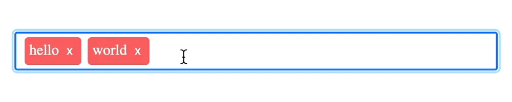
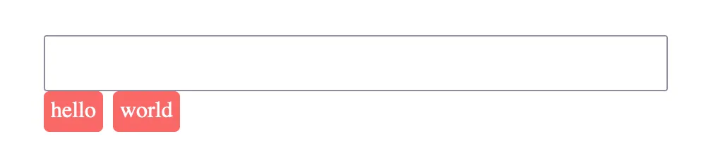
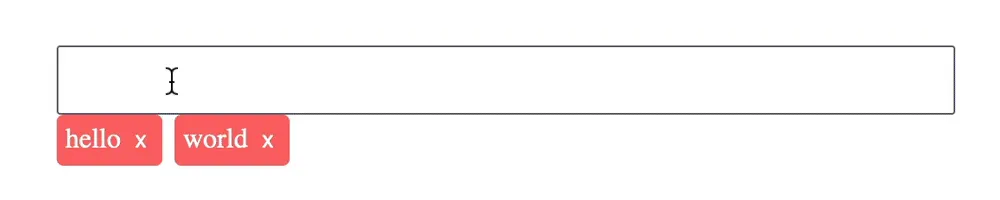
Here's an example of what we're going to build. The tag input allows you to type in custom tags and then commit them to the input when the enter key is pressed. You can also remove tags by either backspacing on an empty input (that is, an input with no tag currently being typed) or by clicking on the little x's at the end of each tag.
The input will also support limiting the tags to only certain values that will display on focus and be filtered down as the user types.
Best of all, these features will be built so that the component is reusable and has an intuitive interface that works much like a normal input element.
Keeping Up with and Displaying Tags
Now that we've seen what it is we're building, let's dive into the code! In the Code Sandbox, I've used Vue CLI to bootstrap a Vue 3 project. You can do the same or use Vue CLI or Vite on your local machine. Then, let's just throw some boilerplate code into a single file component.
// components/TagInput.vue
<template>

</template>
<script>
export default {
 setup(){

 }
}
</script>
Next, let's import the ref function from Vue and use it for storing our component's existing tags. We can initialize it to an array with some dummy tags in it so that we can see what we're working with a little better. Lastly, we need to return it from the setup function in order to expose it to the template.
<script>
import {ref} from 'vue'
export default {
setup(){
const tags = ref(['hello', 'world']);
return { tags }
}
}
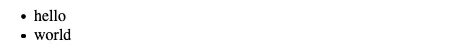
</script>With a way to keep track of the tags in place, we can now work on displaying them in the template. This may be the piece that seems most puzzling, since no native input can display tags like we desire to do, but in reality it's fairly straightforward. We can just use an unordered list in which we'll loop over the tags. Then, later on we can use some custom styling and a little javascript to get things positioned over the input as you'd expect them to be. (Also, for what it's worth, I'm no accessibility expert, so for those of you who are, feel free to leave a comment if this could be improved! ?)
<template>
<div class="tag-input">
<ul class="tags">
<li v-for="tag in tags" :key="tag" class="tag">
{{ tag }}
</li>
</ul>
</div>
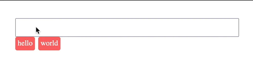
</template>This results in a plain looking unordered list.
We can then snaz it up a bit with some custom styles.
<style scoped>
ul {
  list-style: none;
  display: flex;
  align-items: center;
  gap: 7px;
  margin: 0;
  padding: 0;
}
.tag {
  background: rgb(250, 104, 104);
  padding: 5px;
  border-radius: 4px;
  color: white;
  white-space: nowrap;
  transition: 0.1s ease background;
}
</style>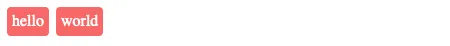
Those are definitely starting to look like tags but where is the input? It's coming but we need a little more ground work first.
New Tag
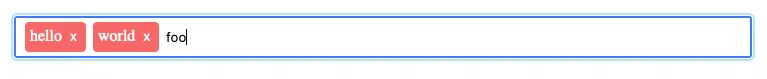
Now, lets create a variable called newTag, to keep up with the current tag that the user is in the process of typing. What do I mean? Think of it this way: a tag input already has the "hello" and "world" tags committed. These are stored in the tags variable. Then the user starts typing "foo" and has not yet committed the tag by pressing enter. "foo" is what will be stored in our new newTag variable.
<script>
import {ref} from 'vue'
export default {
 setup(){
    const tags = ref([]);
    const newTag = ref('') //keep up with new tag
    return { tags, newTag }
 }
}
</script>
Now we can add an input to the template just above the ul and bind the newTag variable to it with v-model.
<input v-model="newTag" type="text" />
<ul class="tags">...</ul>
With the binding in place, when the user types into the input, the value of newTag will be updated to reflect what's typed into said input.
We can also add a couple styles just to make the input a little cleaner.
input {
  width: 100%;
  padding: 10px;
}
Adding the New Tag
This gets us so close to adding a new tag! Since we have the newTag value readily available in Javascript-land, we're ready to create an addTag function. This should be defined within the setup function. addTag will accept a tag to add as an argument (we'll pass newTag to this in a minute). Then we'll push that tag into the tags variable.
setup(){
  //...
  const addTag = (tag) => {
    tags.value.push(tag); // add the new tag to the tags array
  };
}
Notice here that you have to target tags.value when calling .push. This is because it is a reactive reference created by Vue's ref function. When we're in the template we don't have to think about this, as the .value is automatically handled for us. However, inside of the script tag, if we ever want to get or set the tags value we need to target tags.value.
Lastly, we'll reset the value of newTag so that the input gets cleared and is ready for another tag once a new tag is added.
const addTag = (tag) => {
  tags.value.push(tag);
  newTag.value = ""; // reset newTag
};
With the addTag function available, we can now expose it to the template by returning it from the setup function.
setup(){
  //...
  return { tags, newTag, addTag }
}
To note, from now on in this article, I will not mention the need to return any variables or functions from the setup method for brevity's sake. Take this as your warning to do so yourself for any future variables needed in the template.
Now we can bind the addTag method to the keydown event on the input and pass it the newTag. We'll also use the enter key modifier so that it only adds a tag when the user presses enter instead of on every keystroke.
<input
  ...
  @keydown.enter="addTag(newTag)"
/>
To improve the user experience, we'll also account for pressing tab to enter a new tag. This time we'll also need to add the prevent modifier so that tabbing does not move focus away from the input.
<input
  ...
  @keydown.enter="addTag(newTag)"
  @keydown.prevent.tab="addTag(newTag)"
/>
Removing a Tag
The logical next step for us now is to allow removing tags from the input, so let's create a removeTag function. It's logic is fairly straightforward. It takes in the index of the tag to remove and then uses .splice to remove 1 item from the tags array at that index.
const removeTag = (index) => {
  tags.value.splice(index, 1);
};
To cater to the best user experience we'll provide 2 ways of deleting a tag.
- allow backspacing on an empty input (that is an input with no new tag value) to delete the last tag in the list
- allow deleting specific tags by clicking an
xon that tag.
Click X to Remove a Specific Tag
Let's handle the second scenario first as it's actually the simpler of the two. First, we can add an x button inside each tag, binding the removeTag function to it's click event. Then the index to pass the function can be accessed by modifying the v-for.
<li v-for="(tag, index) in tags" :key="tag" class="tag">
  {{ tag }}
  <button class="delete" @click="removeTag(index)">x</button>
</li>
Finally, we can smooth out the UI with a few styles.
.delete {
  color: white;
  background: none;
  outline: none;
  border: none;
  cursor: pointer;
}
Backspacing to Remove the Last Tag
In order to remove the last tag we should be able to call the removeTag method on the input's keydown event with the delete modifier. For the index to remove we could specify the tags lengths minus 1 since the length since the array is 0 indexed.
<input
  ...
  @keydown.delete="removeTag(tags.length - 1)"
>
Unfortunately, this isn't quite enough as now anytime the user presses the backspace the last tag is removed even if they were just trying to backspace a character from the new tag.
To fix that we can check to see if there are any characters present in the new tag and then only remove the last tag if there is not.
<input
  ...
  @keydown.delete="newTag.length || removeTag(tags.length - 1)"
>
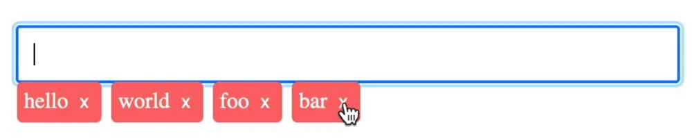
Positioning the Tags
So far we're able to type into the input to form new tags and press enter to commit them. Then we're able to remove them again either by way of the x button or by backspacing. Congrats! At this point, we've completed the basic functionality of the tag input.
There are still embellishments that can be added but the one glaring feature that is still lacking is the position of the tags. Right now they just show up below the input which doesn't make this feel like a tag input at all. They need to be right there in the input.
The majority of this can be handled with some CSS. To place the tags over the input, we can make the container element relative and then position the tags ul absolutely, pushing it in 10px from the left to match the padding on the input.
.tag-input {
  position: relative;
}
ul{
  ...
  position: absolute;
  top: 0;
  bottom: 0;
  left: 10px;
}
We can also give the ul a max width of 75% so that there is always room to the right of the tags to type. Then any overflow tags can scroll horizontally.
ul {
  ...
  max-width: 75%;
  overflow-x: auto;
}
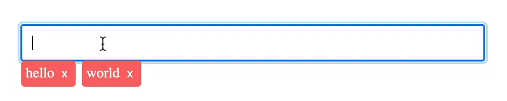
Positioning the Cursor
CSS alone though is not enough because we still need to push the cursor over to the proper position in the input. Otherwise we would be typing underneath any existing tags!
To push the cursor position over, we'll need to dynamically update the left padding on the input anytime a new tag is added. We can start by making a reactive reference to hold the value of the left padding. It'll be initialized to 10 since that's the padding all around the input.
setup(){
  //...
  const paddingLeft = ref(10);
}
Then we need to bind the paddingLeft variable to the style attribute of the input.
<input
  ...
  :style="{ 'padding-left': ${paddingLeft}px }"
/>
Now comes the fun part! How do we know what to set that padding left to and when? And actually, breaking it down in a question like that actually lends itself to a fairly simple answer. We want to set the padding to the width of the tags ul (plus a little more probably to give it some breathing room) and we want want to do that whenever the width of the tags ul changes (ie. when a tag is added or removed).
Let's handle getting the width first. Whenever you want to interact directly with the DOM in Vue, which is necessary on rare occasion, you need to create a template ref. A template ref is just like a reactive ref created with the ref function but instead of referencing primitive Javascript data types it references a DOM node. To create a template ref in Vue, all you need to do is add the ref attribute to the DOM element you want to have access to and give it a name to reference it by.
<ul class="tags" ref="tagsUl">Then inside the setup function, you create a reactive ref by the same name and return it from the setup method and voila, you've got access to the DOM element in the script section as soon as the component is mounted.
setup(){
  //...
  const tagsUl = ref(null)
  return {
    //...
    tagsUl
  }
}
With the tags ul in hand we can now create a function to read it's width and set the paddingLeft variable appropriately.
const setLeftPadding = () => {
  const extraCushion = 15
  paddingLeft.value = tagsUl.value.clientWidth + extraCushion;
}
Now, in order to call it at the right time, we can watch the tags variable with the deep option. The deep option is necessary since the array itself isn't reassigned but rather the members of it change. We'll also use nextTick to ensure the DOM updates are complete and the width of the tags ul is accurate
import { ref, watch, nextTick } from "vue";
export default{
  setup(){
    //...
    watch(tags, ()=> nextTick(setLeftPadding), {deep: true});
  }
}
Let's also call the setLeftPadding function when the component mounts. This will account for any tags like "hello" and "world" that already exist on the input before any changes are made.
import { ref, watch, nextTick, onMounted } from "vue";
export default{
  setup(){
    //...
    onMounted(setLeftPadding)
  }
}
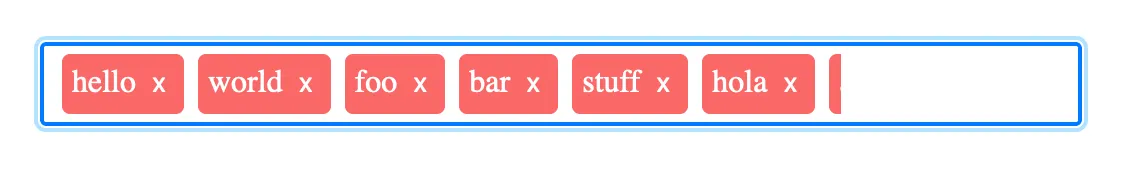
There's one more thing we can handle when the tags change as you can see from the gif above. When the tags overflow the tags ul, we need to scroll the tags ul to the end so that you can see the most recently added tags. We can do this when we set the left padding.
const setLeftPadding = () => {
  //...
  tagsUl.value.scrollTo(tagsUl.value.scrollWidth, 0);
};
Then to make the function name more appropriate we can change it to onTagsChange.
const onTagsChange = () => {
  // set left padding
  const extraCushion = 15;
  paddingLeft.value = tagsUl.value.clientWidth + extraCushion;
  // scroll tags ul to end
  tagsUl.value.scrollTo(tagsUl.value.scrollWidth, 0);
};
watch(tags, () => nextTick(onTagsChange), { deep: true });
onMounted(onTagsChange);
Making it Reusable
So far, there is no real way to use the component. The value is set inside of it and it never goes back out again. Let's fix that.
How can we make it feel more like a native input that works with v-model? The Vue 3 docs state that in "3.x v-model on the custom component is an equivalent of passing a modelValue prop and emitting an update:modelValue event"
So that means we need to initialize the value of tags to a modelValue prop and when the tags change emit a update:modelValue event.
Let's do that. First, we need to accept the modelValue prop and then set tags to it.
<script>
export default{
  props:{
    modelValue: { type: Array, default: ()=> [] },
  },
  setup(props){
    const tags = ref(props.modelValue);
  }
}
</script>
This gets the value going into the component nailed down. In order to send it out again we can emit a update:modelValue event whenever the tags change. And it just so happens we already have an onTagsChange function for that!
In order to access emit we can destructure the context object, which is available through the second argument of the setup method.
setup(props, {emit}){
  //...
  const onTagsChange = () => {
    //...
    emit("update:modelValue", tags.value)
  }
}
Now we can interact with the tag input with v-model and it feels just like a native input!
// App.vue
<template>
  <div>
    <TagInput v-model="tags" />
    <ul>
      <li v-for="tag in tags" :key="tag">{{ tag }}</li>
    </ul>
  </div>
</template>

<script>
import TagInput from "./components/TagInput.vue";
export default {
  name: "App",
  components: {
    TagInput: TagInput,
  },
  data() {
    return {
      tags: ["Hello", "App"],
    };
  },
};
</script>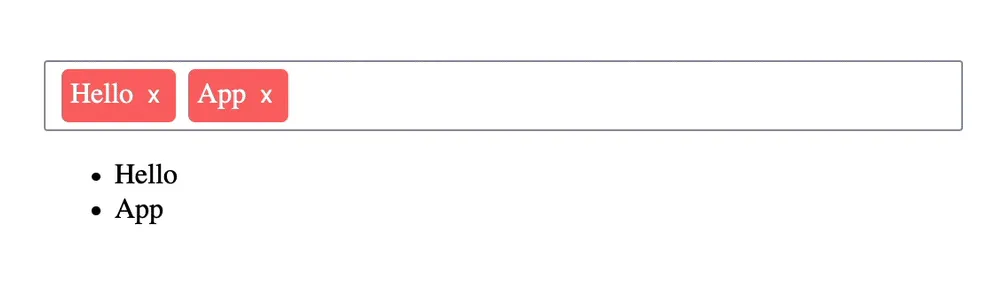
Conclusion
There is still plenty more that can be done to beef up the functionality of our tag input but with the simple and straightforward codebase we've maintained up until this point, adding in those new features is almost trivial. Some of those features that I've completed in this CodeSandbox include:
- tag options
- preventing duplicate tags
- preventing empty tags
- and showing number of tags
Go check out the code if you're interested and see how these other features were implemented. And if you're up to the challenge, fork the sandbox and create your own awesome features (and don't forget to share your creation in the comments here if you do)!
Start learning Vue.js for free

Comments
Latest Vue School Articles

5 Component Design Patterns to Boost Your Vue.js Applications

Vibe Coding a Collaborative Editor with Comment Support with Nuxt UI and Jazz
Our goal is to be the number one source of Vue.js knowledge for all skill levels. We offer the knowledge of our industry leaders through awesome video courses for a ridiculously low price.
More than 200.000 users have already joined us. You are welcome too!
© All rights reserved. Made with ❤️ by BitterBrains, Inc.