Accessible Alerts, Dialogs, and Alert Dialogs with ShadCN Vue

Let’s talk about alerts, dialogs, and alert dialogs with ShadCN-Vue. When are they useful? How do you use them? And what about accessibility?
👉 If you’d like more info on Shadcn Vue or prefer learning via video, we’ve got a full course dedicated to this topic and more. Check it out!
Understand the differences — Alerts, Alert Dialogs, and Dialogs
Before we install and code, it's important to understand the intended purpose of each UI primitive. Although they may look similar visually, they have different semantics and different accessibility expectations.
- Alert — A callout or message that grabs the user's attention. It is typically used to announce time-sensitive or important information that is displayed dynamically (for example, an error or success message after a form submission). Alerts are disruptive and must be used sparingly. The surrounding element usually has role="alert".

- Alert Dialog — A modal UI element that interrupts the user's workflow to communicate urgent information and expects a response (for example, confirm or cancel). It is similar in intent to JavaScript's native
confirm()and must include at least one focusable control. It typically has role="alertdialog" and uses aria-labelledby and aria-describedby to label and describe the dialog.
- Dialog — A more general-purpose modal; it displays content on top of the page and does not necessarily require an immediate binary response. Use it for forms, image viewers, or any overlay with content that can be consumed without confirming or canceling. It typically has role="dialog" and proper aria attributes.
These distinctions are important not only for user experience but for accessibility. Screen readers and keyboard users rely on semantics like role="alert" or role="alertdialog" as well as correct focus management to interact confidently with your application.
Install ShadCN Vue components (quick CLI)
The ShadCN Vue approach encourages installing component files directly into your source. The workflow goes like this:
- Run the ShadCN installer to add the component files to your source directory.
npx shadcn-vue@latest add button- Import and use the component(s)
<script setup lang="ts">
import { Button } from "@/components/ui/button"
</script>

<template>
  <Button>Button</Button>
</template>
Implement an Alert — Semantics and Usage
An alert is typically used for transient messages that you want screen readers to announce immediately when they appear. ShadCN Vue provides styled, accessible alert components that follow this pattern. The key semantic element is role="alert" applied to the element that contains the message.
When building an alert, keep these rules in mind:
- Only display alerts in response to user actions or dynamic changes; avoid using alerts for content that appears on initial page load.
- Only show a limited number of alerts at a time; many alerts create a disruptive user experience.
- Include a clear title and description; icons help convey the type of message (error, warning, success).
Example Usage
<script setup lang="ts">
import { Rocket } from "lucide-vue-next"
import { Alert, AlertDescription, AlertTitle } from "@/components/ui/alert"
</script>

<template>
  <Alert>
    <Rocket class="h-4 w-4" />
    <AlertTitle>Heads up!</AlertTitle>
    <AlertDescription>
      You can add components to your app using the cli.
    </AlertDescription>
  </Alert>
</template>
Example Output
<div
  class="relative w-full ..."
  role="alert"
>
  <svg .../>
  <h5 class="mb-1 font-medium ...">Heads up!</h5>
  <div class="text-sm">
    You can add components to your app using the cli.
  </div>
</div>
The important bit is the role="alert" — this causes screen readers to announce the message when it appears. The ShadCN Vue alert component will render this role for you if you use the supplied components from the library.
Build an Alert Dialog — Require a Response
An alert dialog is a modal that requires an explicit response — such as confirming a destructive action or canceling. In ShadCN Vue, an alert dialog is broken into composable subcomponents that you assemble: trigger, content, header, title, description, and actions. The components handle focus management, keyboard handling (Escape to close), and aria attributes out of the box.
Key behaviors to expect from a well-built alert dialog component that comes standard with Shadcn Vue:
- Initial focus lands on the cancel or safe action so keyboard users can quickly dismiss the dialog by pressing Enter.
- Tabbing is trapped within the dialog; nothing behind the modal receives focus.
- Escape closes the dialog.
- Dialog has
role="alertdialog"and usesaria-labelledbyandaria-describedbyfor labeling and description.
Here's a high-level example of how the alert dialog pieces fit together.
<script setup lang="ts">
import {
AlertDialog,
AlertDialogAction,
AlertDialogCancel,
AlertDialogContent,
AlertDialogDescription,
AlertDialogFooter,
AlertDialogHeader,
AlertDialogTitle,
AlertDialogTrigger,
} from "@/components/ui/alert-dialog"
import { Button } from "@/components/ui/button"
</script>
<template>
<AlertDialog>
<AlertDialogTrigger as-child>
<Button variant="outline">
Show Dialog
</Button>
</AlertDialogTrigger>
<AlertDialogContent>
<AlertDialogHeader>
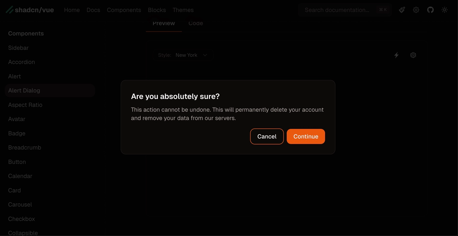
<AlertDialogTitle>Are you absolutely sure?</AlertDialogTitle>
<AlertDialogDescription>
This action cannot be undone. This will permanently delete your
account and remove your data from our servers.
</AlertDialogDescription>
</AlertDialogHeader>
<AlertDialogFooter>
<AlertDialogCancel>Cancel</AlertDialogCancel>
<AlertDialogAction>Continue</AlertDialogAction>
</AlertDialogFooter>
</AlertDialogContent>
</AlertDialog>
</template>Notice the use of as-child in many ShadCN Vue components — it allows the library to forward props and behaviors to whatever element you render (a button, link, or custom component), while keeping the styling and accessibility intact.
Add Custom Event Handlers and Controlled Open State to Alert Dialogs
By default the alert dialog components trigger a close when the action or cancel button is clicked. But ShadCN Vue components are flexible: you can attach event listeners to run custom logic on cancel or continue. You can also control the dialog's open state from outside the component using a bound state variable.
In Vue 3 using the Composition API, you'd typically create a ref and bind it to a named v-model property like open on the dialog. This gives you programmatic control and lets you open the dialog from code, persist state between renders, or perform side-effects when the dialog opens or closes.
<script setup>
import { ref } from "vue";
const open = ref(false);
function handleCancel() {
  // run cancel logic
  // (and no need to manually close, the component handles that for you)
}
</script>
<template>
  <AlertDialog v-model:open="open">
    ...
      <AlertDialogCancel @click="handleCancel">Cancel</AlertDialogCancel>
  </AlertDialog>
</template>
If you set open.value = true before the page renders, the dialog will mount in the open state. If you prefer the dialog to manage its own state, omit v-model and let the component handle its internal state.
Accessibility Deep-Dive — Aria Roles and Attributes
Accessibility is at the heart of these components. Merely adding role="alertdialog" or role="alert" is not enough. You also need proper labeling and keyboard focus management. Here are the critical attributes and behaviors that make these components accessible:
- role: Use
role="alert"for alerts,role="alertdialog"for alert dialogs, androle="dialog"for general-purpose dialogs. - aria-labelledby: Point to the element that contains the dialog title (usually the
<h2>or a dialog title component). - aria-describedby: Point to the element that contains the longer text description, giving screen reader users a clear explanation about the dialog's intent.
- Keyboard focus management: When a modal opens, focus should move into the dialog, and Tab/Shift+Tab should be trapped inside it. When it closes, focus should return to the element that triggered the dialog.
- At least one focusable control: Alert dialogs must expose at least one focusable action (like confirm or close) so assistive technology users can act on the dialog content.
The ShadCN Vue components implement these attributes and behaviors for you, so when you copy the component usage from their docs or the course material, you're getting the accessibility features out-of-the-box.
Dialog Component — Flexible Modal for Content
The regular dialog component shares many characteristics with the alert dialog but is intended for broader use cases. Use it for:
- Displaying forms (where the user edits data, but no immediate confirm/cancel decision is required).
- Showing long-form content that may require scrolling or interactive controls.
- Enlarging images from a gallery or presenting content previews.
Dialog components usually have role="dialog", and you should include DialogTitle and DialogDescription subcomponents (or elements with corresponding IDs) so aria-labelledby and aria-describedby are properly filled.
<script setup lang="ts">
import { Button } from "@/components/ui/button"
import {
Dialog,
DialogContent,
DialogDescription,
DialogFooter,
DialogHeader,
DialogTitle,
DialogTrigger,
} from "@/components/ui/dialog"
import { Input } from "@/components/ui/input"
import { Label } from "@/components/ui/label"
</script>
<template>
<Dialog>
<DialogTrigger as-child>
<Button variant="outline">
Edit Profile
</Button>
</DialogTrigger>
<DialogContent class="sm:max-w-[425px]">
<DialogHeader>
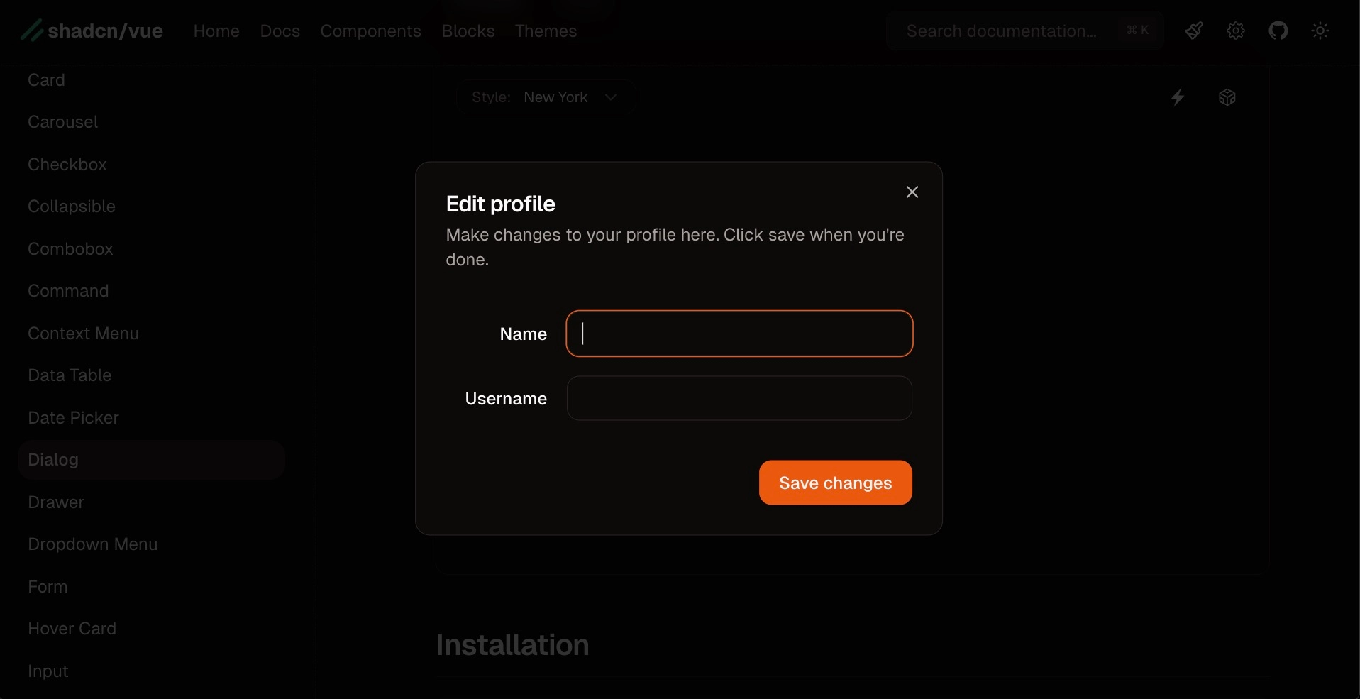
<DialogTitle>Edit profile</DialogTitle>
<DialogDescription>
Make changes to your profile here. Click save when you're done.
</DialogDescription>
</DialogHeader>
<div>The main content here</div>
<DialogFooter>
<Button type="submit">
Save changes
</Button>
</DialogFooter>
</DialogContent>
</Dialog>
</template>Because dialogs can contain lengthy content, ShadCN's dialog component supports scrolling within the dialog content area. You can even configure the dialog so the entire content area scrolls (useful for long forms or documents).
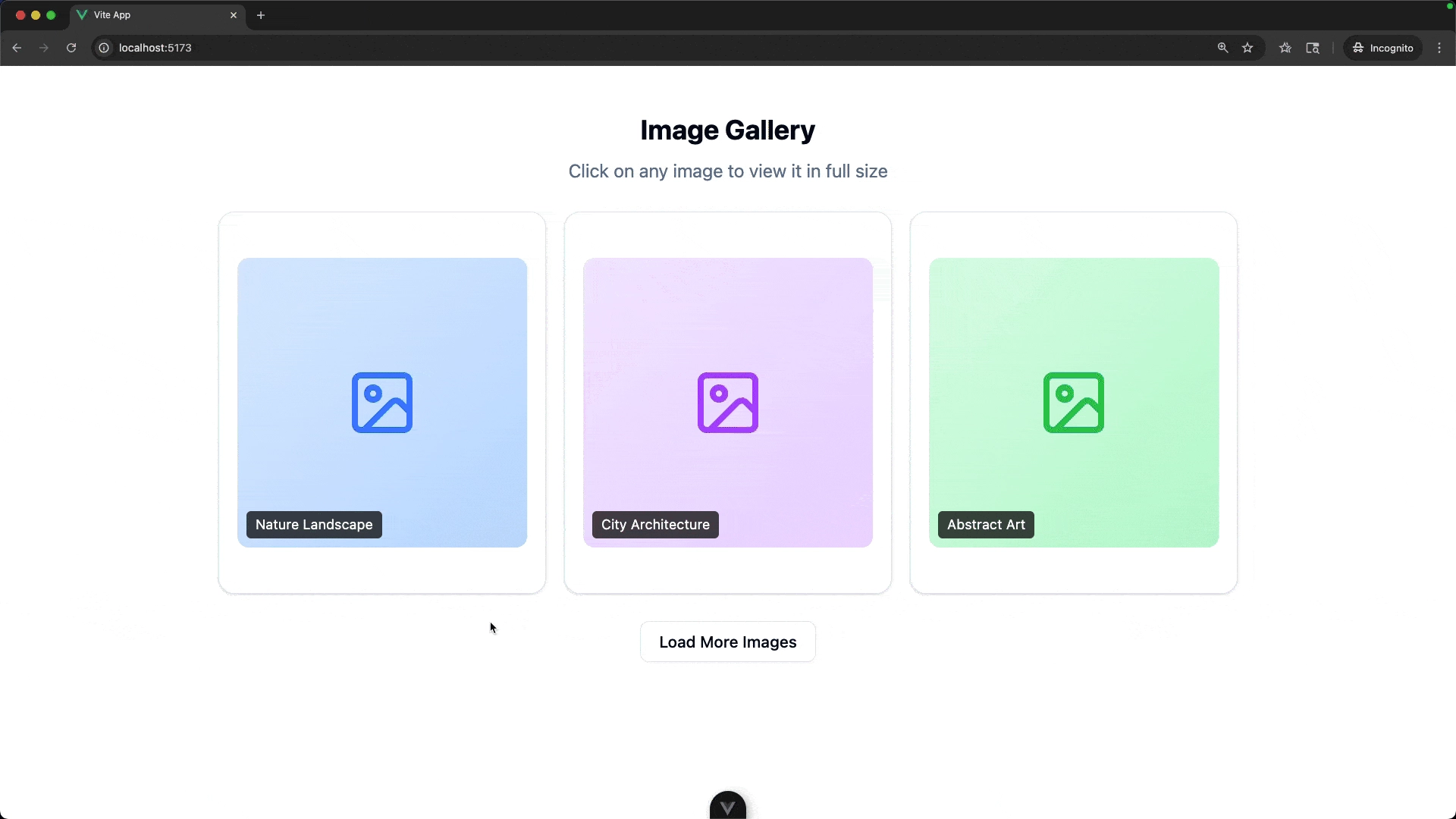
Example From the Course Repository — Dialog Image Gallery
The ShadCN Vue course repository contains an example image gallery that uses the Dialog component. You can review the code for this Dialog specific use case and modify for your own use if you’d like!
This example demonstrates a practical use of the Dialog component: each gallery card is a dialog trigger (using as-child), and the dialog content contains title, description, and an image preview. The component composition keeps markup readable and accessible.
When to Use Which Component — Practical Rules of Thumb
Deciding which component to use is easy if you follow a few simple rules:
- Use Alert when you need to inform the user about something that happened as a result of their action (e.g., form validation error, "Settings saved"). The content is transient and does not require action beyond reading.
- Use Alert Dialog when you need a required response from the user — especially when the action is destructive or irreversible (e.g., deleting an account). This should interrupt workflow and require an explicit confirmation or cancellation.
- Use Dialog for general overlays and content such as forms, image viewers, or detailed content previews. A dialog is for focused tasks but doesn't always require a confirm/cancel answer.
Implementation Tips, Gotchas, and Best Practices
- Copy example usage from docs — When you copy the ShadCN components from the docs, the aria attributes and focus management are configured for you. Use the examples as a baseline and customize styles and text.
- Use as-child judiciously — The
as-childprop is very useful: it lets you render your own element (like a card or a custom button) while inheriting the trigger behavior. Use it consistently to keep your markup semantic. - Limit concurrent alerts — Avoid showing multiple alerts simultaneously. If multiple messages are necessary, aggregate them into a single, clear message where possible.
- Test with assistive tech — Use tools like VoiceOver, NVDA, or ChromeVox and keyboard-only navigation to ensure your dialog flows make sense.
Conclusion and next steps
Alerts, alert dialogs, and dialogs are powerful UI primitives that, when used correctly, make your applications more communicative and accessible. ShadCN Vue provides composable, accessible components so you don't have to implement these behaviors from scratch.
If you’d like to dive further into ShadCN Vue, checkout the full course.
Start learning Vue.js for free

Comments
Latest Vue School Articles

Vue.js – 2025 In Review and a Peek into 2026

VueSchool Black Friday

Our goal is to be the number one source of Vue.js knowledge for all skill levels. We offer the knowledge of our industry leaders through awesome video courses for a ridiculously low price.
More than 200.000 users have already joined us. You are welcome too!
© All rights reserved. Made with ❤️ by BitterBrains, Inc.