
Stop Writing Vue for These UI’s (CSS Took Them Back)

Some “Vue work” is really layout glue: resize listeners, breakpoint props, class toggles for visuals, and getBoundingClientRect math. Modern CSS and declarative HTML have absorbed a huge slice of that. The framework is still the right place for data, auth, routing, permissions, and business rules; it just no longer needs to babysit every visual reaction in the UI.
TL;DR: Vue stays in charge of app state. Let the platform handle more of the presentation.
1. Ditch viewport breakpoints for components that only care about their column
👉 Try it: container-queries.html
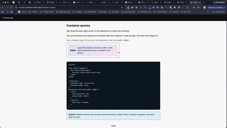
Was: ResizeObserver, matchMedia, or a breakpoint prop threaded through every card so it “knows” when the sidebar got narrow.
Now: Container queries—container-type: inline-size on the wrapper and @container (min-width: …) on the innards. The component responds to its slot, not window.innerWidth. That means the same card can behave differently in the main column, a sidebar, or a dense dashboard grid without any JS deciding what mode it is in.
Reality check: Size container queries are Baseline in current evergreen browsers.
Code (after):
.card-wrap {
  container-type: inline-size;
}
@container (min-width: 380px) {
  .card {
    flex-direction: row;
  }
}
2. Stop toggling parent classes when a child’s state should drive the UI
👉 Try it: has-and-focus.html
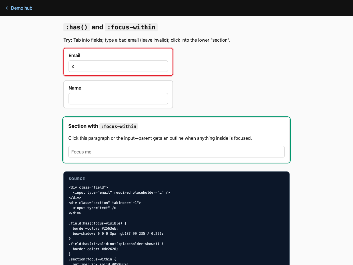
Was: :class="{ error: childInvalid }" and refs so the row turns red when an input fails validation.
Now: :has()—e.g. .field:has(:invalid)—and :focus-within for “this section is active” chrome without tracking focus in script. In other words, the parent can finally react to what’s happening inside it, which used to be one of the main excuses for bubbling state into Vue.
Reality check: :has() is Baseline. Pair :invalid with :not(:placeholder-shown) (or similar) so empty fields don’t flash error on first paint.
Code (after):
.field:has(:invalid:not(:placeholder-shown)) {
  border-color: var(--danger);
}
3. Drop the tooltip positioning library (or most of it)
👉 Try it: popover-anchor.html
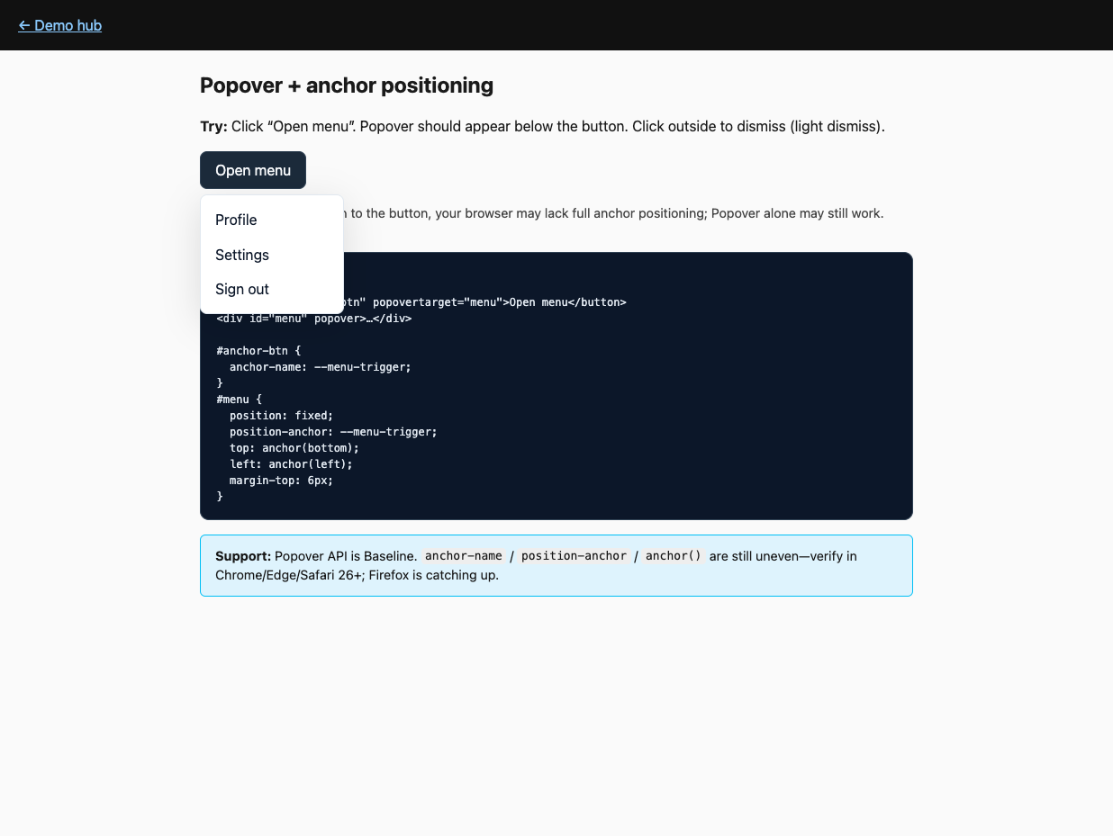
Was: Portals, manual top/left, scroll/resize listeners, z-index hell, and “click outside” boilerplate for every menu.
Now: Popover API for top-layer + light dismiss, plus CSS anchor positioning: anchor-name on the trigger, position-anchor + position: fixed + anchor() on the layer. position-anchor is the explicit link between positioned element and anchor. The browser handles a lot of the annoying overlay behavior for you, so your JS can focus on menu state instead of geometry.
Reality check: Popover is Baseline. Anchor positioning is not universal yet—test Chrome / Edge / Safari 26+; keep a fallback. If the anchor is display: none, the anchored layer won’t show—different from some hand-rolled measurers.
Code (after):
<button style="anchor-name: --t" popovertarget="m">Menu</button>
<div
  id="m"
  popover
  style="position:fixed;position-anchor:--t;top:anchor(bottom);left:anchor(left)"
>
  …
</div>
4. Use <details> for disclosure instead of v-show choreography
👉 Try it: details-transitions.html
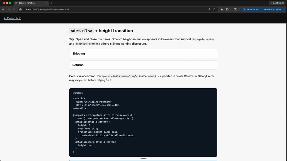
Was: v-if / v-show, transition components, and height animation hacks for FAQs.
Now: Native <details> / <summary>. Animate with ::details-content, interpolate-size, and transition-behavior: allow-discrete where supported; it degrades to instant open/close elsewhere. You get keyboard behavior, semantics, and basic state handling for free before writing a single line of component code.
Reality check: <details> works everywhere; slick height animation is newer (e.g. Chromium 129+ for key pieces). Exclusive accordion via shared name on <details>—verify target browsers before betting the farm.
Code (after):
<details>
  <summary>Shipping</summary>
  <p>Arrives in 3–5 days.</p>
</details>
5. Kill the scroll listener for motion that should track scroll
👉 Try it: scroll-driven.html
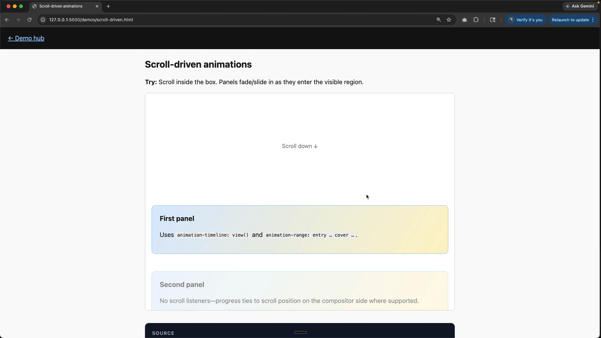
Was: requestAnimationFrame, throttled scroll handlers, or libraries scrubbing transforms from scroll position.
Now: Scroll-driven animations—animation-timeline: view() (or scroll() on a scroll container) so keyframes map to scroll progress. Instead of sampling scroll in JS and pushing numbers into styles, you declare the relationship once and let the rendering engine do the interpolation.
Reality check: Strong in Chromium; Safari and Firefox are catching up—test or provide a reduced motion-friendly static layout.
Code (after):
<div class="panel">
  <!-- Panel content here -->
  <h2>Scroll me into view!</h2>
  <p>This panel will animate as it enters the viewport.</p>
</div>
@keyframes reveal {
from {
opacity: 0;
transform: translateY(40px);
}
to {
opacity: 1;
transform: translateY(0);
}
}
.panel {
animation: reveal linear both;
animation-timeline: view(); /* or animation-timeline: scroll(); */
animation-range: entry 0% cover 35%;
}6. Let the browser morph the UI between routes (where it’s worth it)
👉 Try it: view-transitions.html
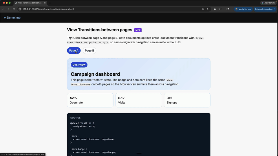
Was: Custom FLIP wrappers or route transitions duplicating what the compositor could do.
Now: View Transitions API for same-document (and, where configured, cross-document) transitions; style with ::view-transition-*. Vue Router still navigates; you opt into the visual handoff. It is less about replacing your router and more about deleting the custom animation scaffolding around route changes.
Reality check: Same-document support is good in Chromium and Safari 18+; still evolving elsewhere. Hybrid: call document.startViewTransition(() => …) when updating the DOM.
Code (after):
document.startViewTransition(() => {
  /* mutate DOM / swap route fragment */
});
7. Delete half your dark-mode CSS duplication
👉 Try it: light-dark.html
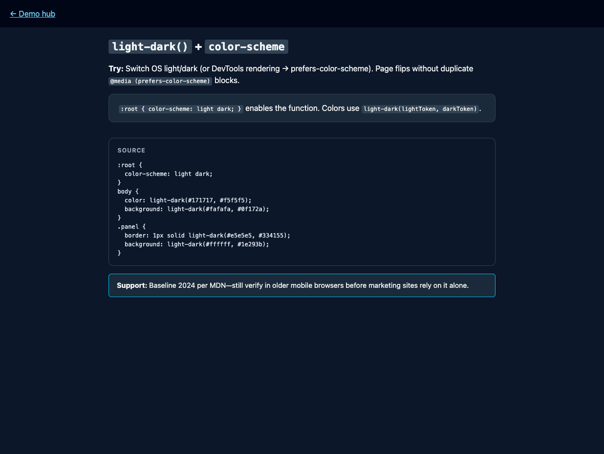
Was: Parallel blocks in @media (prefers-color-scheme: dark) for every tokenized color.
Now: light-dark(light, dark) plus color-scheme: light dark on :root so one declaration picks the pair from the used color scheme. For simple token pairs, this is much easier to scan than maintaining two mirrored blocks and hoping they stay in sync.
Reality check: Baseline 2024 per MDN—still sanity-check older WebViews if you ship embedded browsers.
Code (after):
:root {
  color-scheme: light dark;
}
body {
  color: light-dark(#171717, #f5f5f5);
  background: light-dark(#fafafa, #0f172a);
}
8. Generate palette steps in CSS, not in a computed factory
👉 Try it: color-tokens.html
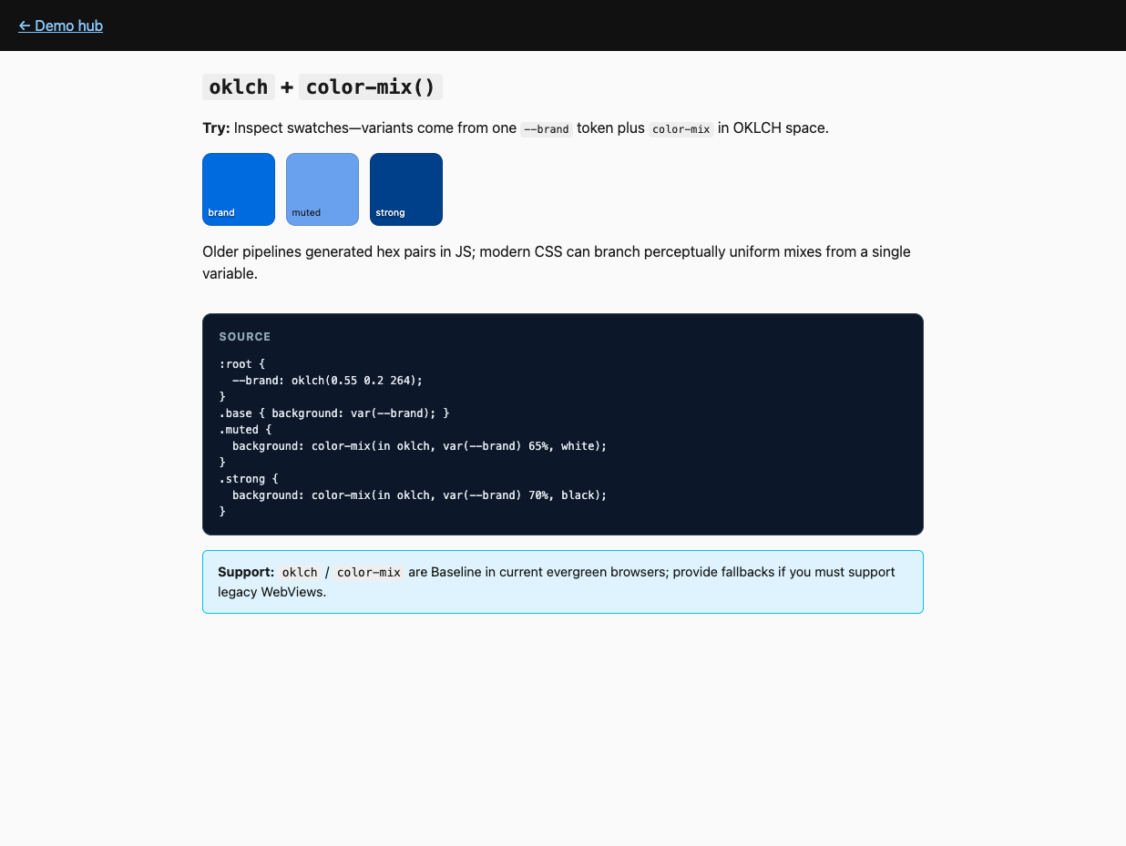
Was: Functions in JS spitting out hex strings for hover/active states.
Now: oklch() (or lch) for perceptually even colors and color-mix(in oklch, …) to derive variants from one custom property. That lets design tokens stay in CSS, where hover, active, and muted states can be derived close to the styles that use them.
Reality check: Baseline in modern evergreen; provide fallbacks only if you truly still target legacy engines.
Code (after):
:root {
  --brand: oklch(0.55 0.2 264);
}
.btn:hover {
  background: color-mix(in oklch, var(--brand) 85%, white);
}
9. Fluid type without resize observers
👉 Try it: clamp-fluid.html
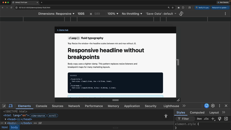
Was: Reading container width and setting fontSize from Vue.
Now: clamp(min, preferred, max) (often with vw in the preferred term) for typography and spacing. You define the lower bound, the upper bound, and the fluid behavior between them, and the browser handles the in-between math continuously.
Reality check: clamp() is universally available in browsers you care about in 2026.
Code (after):
h1 {
  font-size: clamp(1.5rem, 4vw + 0.75rem, 3rem);
}
10. Ship a reading-progress bar without scroll listeners
👉 Try it: reading-progress.html
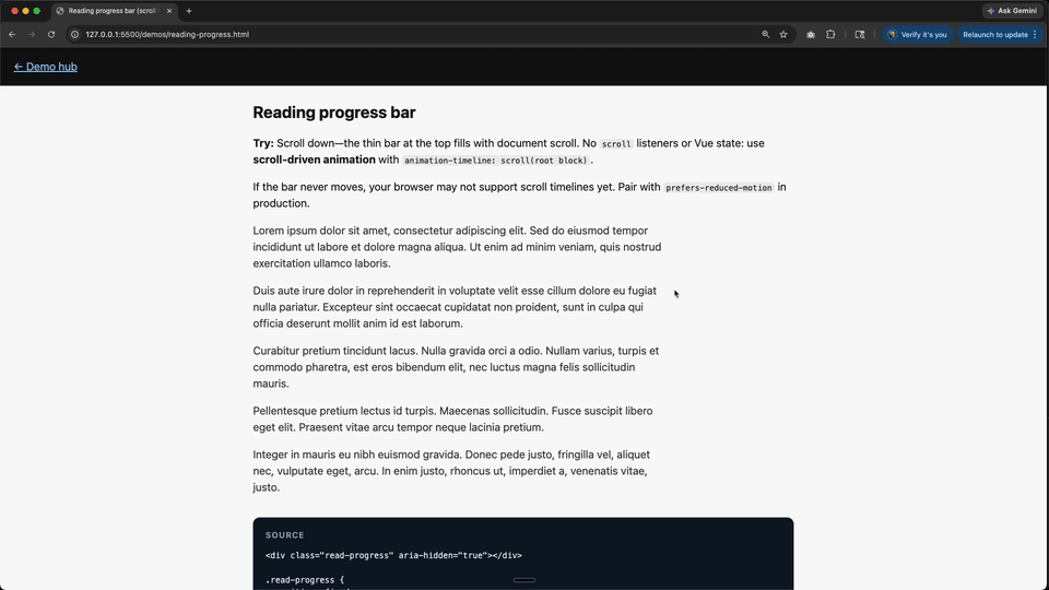
Was: window scroll handlers (or Vue refs + rAF) updating style.width or a bound percentage on a fixed top bar.
Now: Scroll-driven animation: tie keyframes to animation-timeline: scroll(root block)—e.g. animate transform: scaleX(0) → scaleX(1) on a thin fixed element. Same family of APIs as §5 (scroll timelines); there it’s often view() over a scroll container, while here the timeline is the document scroller. It is a clean fit for article chrome because there is no app state to manage, just a visual readout of how far down the page the user is.
Reality check: Scroll timelines are uneven outside Chromium—test Safari/Firefox. Use @supports (animation-timeline: scroll(root block)) if you need a no-animation fallback. Respect prefers-reduced-motion for anything beyond a tiny indicator.
Code (after):
.read-progress {
  position: fixed;
  top: 0;
  left: 0;
  right: 0;
  height: 4px;
  transform-origin: 0 50%;
  transform: scaleX(0);
}
@supports (animation-timeline: scroll(root block)) {
  .read-progress {
    animation: read-progress linear forwards;
    animation-timeline: scroll(root block);
  }
}
@keyframes read-progress {
  to {
    transform: scaleX(1);
  }
}
11. Map “how far between A and B” to a number with progress()
👉 Try it: progress-fn.html
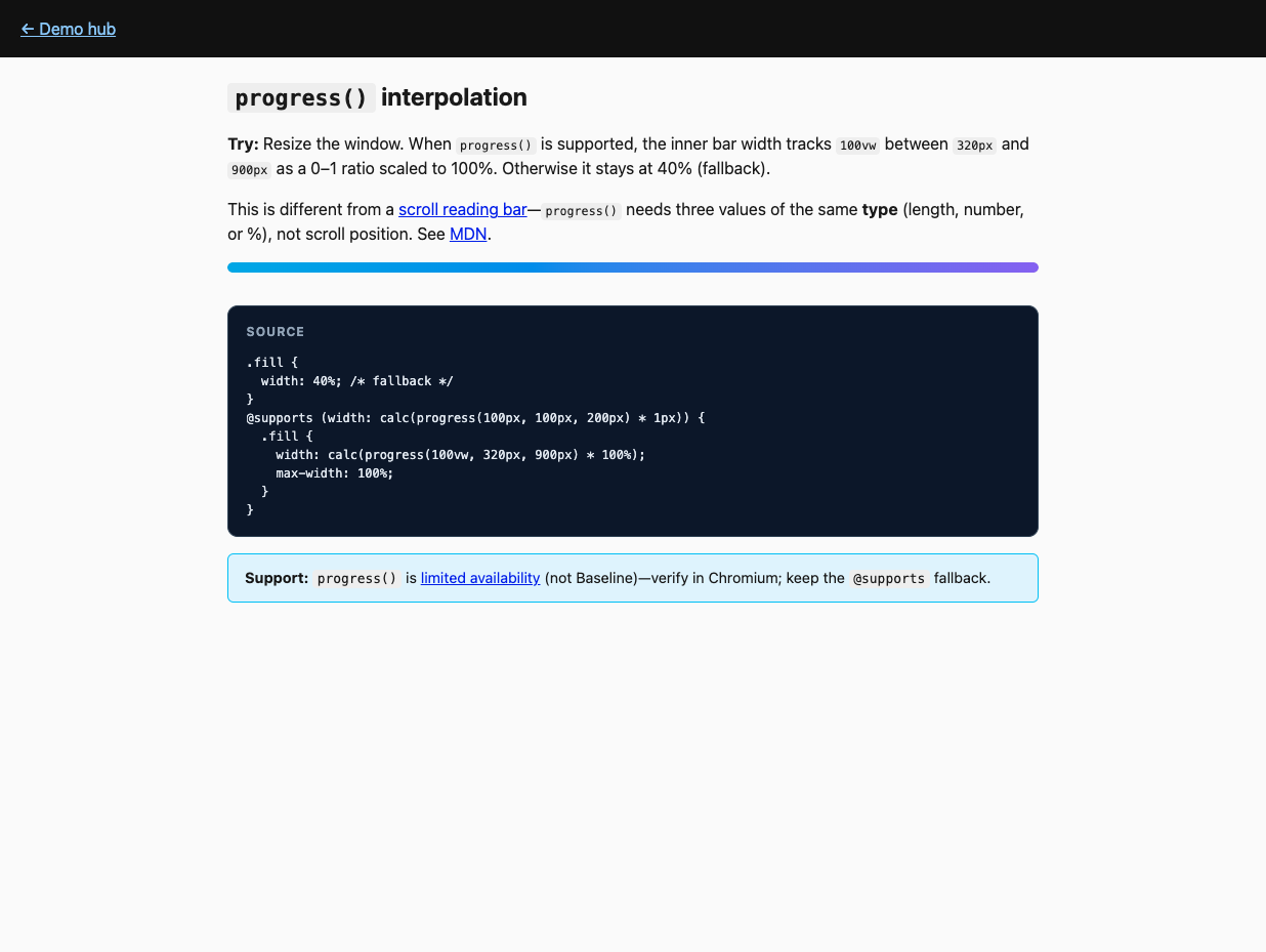
Was: computed(() => (x - min) / (max - min)) feeding inline styles for layout or motion.
Now: progress(value, start, end) returns a clamped 0–1; multiply with calc() for lengths, opacity, color channels, etc. Arguments must share the same type (all lengths, all numbers, or all percentages—no mixing). See MDN progress(). It is useful whenever the browser already knows a value and you just need to map "between these two thresholds" into a styling number. This is not scroll position: for a page reading bar, use §10 instead.
Reality check: Limited availability (not Baseline)—wrap in @supports and ship a fallback width or color.
Code (after):
@supports (width: calc(progress(100px, 100px, 200px) * 1px)) {
  .bar {
    width: calc(progress(100vw, 320px, 900px) * 100%);
  }
}
12. Highlight search matches without wrapping every hit in <mark>
👉 Try it: custom-highlight.html
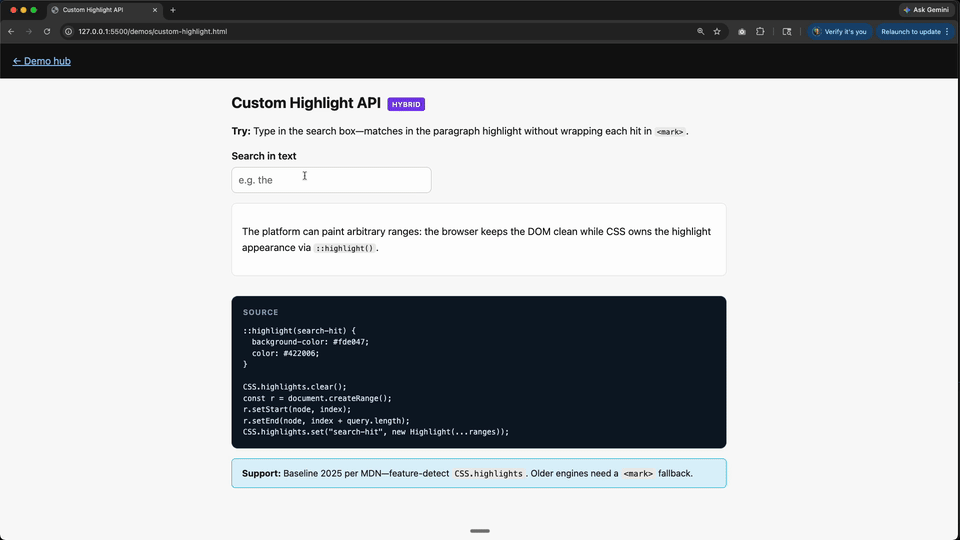
Was: Splitting text nodes, reactive arrays of spans, or fragile v-html.
Now: CSS Custom Highlight API—script builds Ranges and registers CSS.highlights; ::highlight(name) styles them. Hybrid by design: JS finds ranges; CSS owns appearance. That split is the win: your search logic stays imperative, but your highlight styling stops depending on DOM surgery.
Reality check: MDN marks Baseline 2025; feature-detect CSS.highlights and fall back to <mark> when missing.
Code (after):
::highlight(search-hit) {
  background-color: #fde047;
}
CSS.highlights.set("search-hit", new Highlight(range1, range2));13. Stop fighting specificity with !important soup
👉 Try it: layers.html
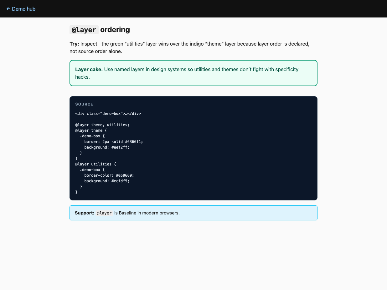
This one is less "you wrote too much Vue" and more "your styling system keeps starting fights," but it belongs here anyway.
Was: “Utilities” injected last with escalating specificity or runtime style patches.
Now: @layer declares order (base, components, utilities) so source order stops being a cage match. Once the cascade is explicit, you need fewer escape hatches, fewer overrides, and far less guessing about why a class lost.
Reality check: @layer is Baseline in modern browsers—great fit for design systems next to Vue SFC styles.
Code (after):
@layer theme, utilities;
@layer theme {
  .btn {
    background: #6366f1;
  }
}
@layer utilities {
  .btn {
    background: #059669;
  }
}
Try this Monday
- Container queries on one overloaded card component.
:has()on one form row that used to sync error classes upward.<dialog>orpopoveron one overlay that still ships a homemade focus trap.- Reading progress bar on a long article page if you still have a
scrolllistener driving width.
Vue stays. The busywork doesn’t have to.
Start learning Vue.js for free

Comments
Latest Vue School Articles

5 Component Design Patterns to Boost Your Vue.js Applications

Vibe Coding a Collaborative Editor with Comment Support with Nuxt UI and Jazz
Our goal is to be the number one source of Vue.js knowledge for all skill levels. We offer the knowledge of our industry leaders through awesome video courses for a ridiculously low price.
More than 200.000 users have already joined us. You are welcome too!
© All rights reserved. Made with ❤️ by BitterBrains, Inc.