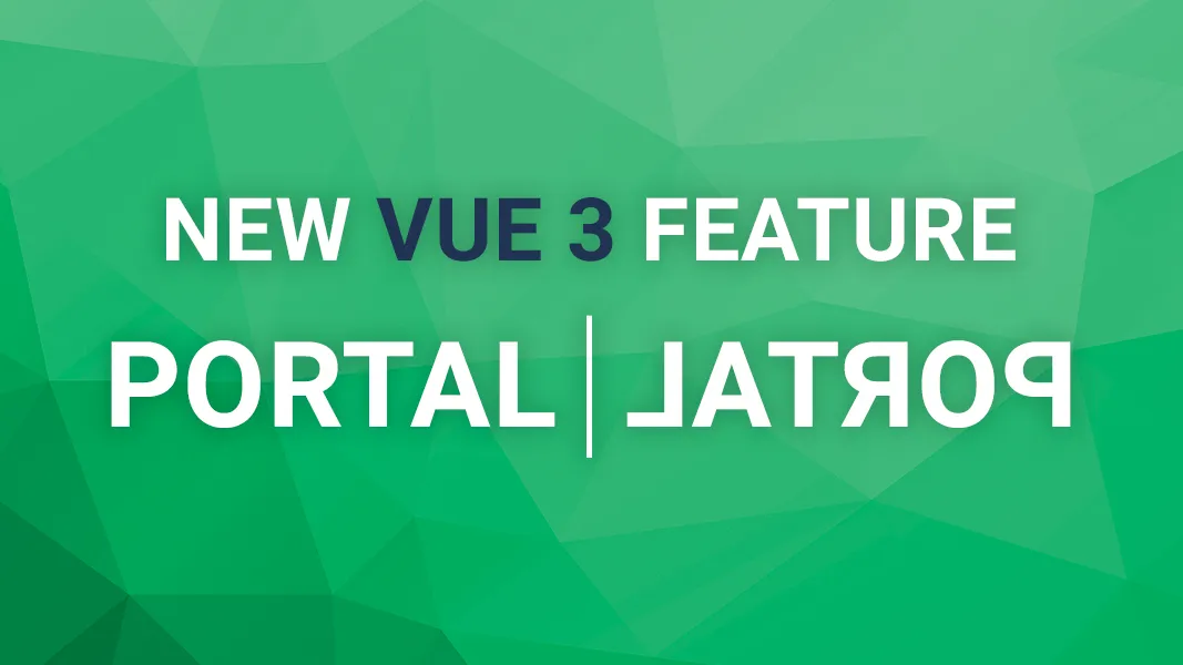
Portal – a new feature in Vue 3

Recently I wrote about new features available in Vue 3 where I briefly introduced which features we can expect in the next major release of Vue.js.
In today's article, I want to talk a little bit more about one of the most useful ones - Portal
This article is based on vue-next repository content. There is no guarantee that the features mentioned in this article will land in Vue 3 exactly in the described form (but most likely they will).
What is portal?
Portal is a well-known concept from React that was also adopted in Vue 2 through third-party plugins like portal-vue. Its name suggests that it’s responsible for “teleporting” something from one to another place… and this is exactly what it does!
With a portal, you can render a component in a different place in the DOM tree, even if this place is not in your app's scope. Portals are very handy when working with modals, notifications, popups or other elements that are sensitive to where they’re placed in the DOM tree.
Let me show you
<!-- UserCard.vue -->
<template>
  <div class="user-card">
    <b> {{ user.name }} </b>
    <button @click="isPopUpOpen = true">Remove user</button>
    <div v-show="isPopUpOpen">
      <p>Are you sure?</p>
      <button @click="removeUser">Yes</button>
      <button @click="isPopUpOpen = false">No</button>
    </div>
  </div>
</template>
In the above code example we have a UserCard component that lets us remove a certain user from the database. After clicking the button, we will see a confirmation popup where we can confirm the action and remove the user with the removeUser method.
Keeping related components (the confirmation popup) in the same place is a good practice in terms of code maintenance. But when it comes to UI elements that should appear on top of the others, it can lead to some problems.
The first problem that we can encounter is the fact that user-card class, as well as every other class higher in the DOM hierarchy, can affect the appearance of our popup. For example, if any of the containers have visibility: 0.5, the popup’s visibility will be affected.
Guaranteeing that our popup will appear on top of other components is another challenge. You can think about DOM elements as layers. We put those layers on top of each other to make a layout. Usually, when we want to cover some of the layers with other ones, we do this intentionally by either putting another element inside this layer or after it.
One way of dealing with this issue is to use z-index CSS property to change the natural order of an element’s appearance. However, this method is not very elegant and usually gives us another challenge to deal with when we have multiple elements positioned with z-index
This is why we usually place UI elements that should appear on top of the other ones just before the closing </body> tag. This way we don’t need to do any hacks to be sure that our popup shows exactly where and how we want. It also ensures that other elements don't cover it.
So it looks like we have two conflicting good practices:
- The first one tells us to keep related components together, which implies keeping popup inside
UserCardcomponent - The second tells us to put the popup right before the closing
bodytag.
To fulfill both requirements, we need to make sure that even though the popup code is located in the UserCard component, it will render somewhere else - ideally just before the closing body tag.
Thankfully this is precisely what portals were made for!
Portals in Vue 3
Among many other features, Vue 3 will come with native support for portals in the form of a Portal component.
The good news is that the Portal component is very simple! It has only one property - target and a default slot. The slot content will render in the DOM element, that is selected by the query selector passed to the target prop.
<!-- In some nested Vue component -->
<NestedComponent>
  <Portal target="#popup-target">
    <PopUp />
  </Portal>
</NestedComponent>
<!-- before closing body tag -->
<div id="popup-target"></div>
In the above example, the PopUp component will render in the div with an id of portal-target, even though it’s positioned inside NestedComponent.
Knowing this, we can rewrite our UserCard component into this form:
<!-- UserCard.vue -->
<template>
  <div class="user-card">
    <b> {{ user.name }} </b>
    <button @click="isPopUpOpen = true">Remove user</button>
    <Portal target="#popup-target">
      <div v-show="isPopUpOpen">
        <p>Are you sure?</p>
        <button @click="removeUser">Yes</button>
        <button @click="isPopUpOpen = false">No</button>
      </div>
    </Portal>
  </div>
</template>
Simple and easy, isn’t it? ? Now we can keep our code properly structured without being forced to do nasty workarounds to keep it working!
If you’re still curious and want to see other examples, here you can find a small website with a modal, using Vue 3 portals. You can also browse test scenarios on vue-next repository.
Summary
Portal is one of the nicest additions in Vue 3. It simplifies working with elements like modals and popups and makes it extremely easy to render it on top of their DOM elements without ugly workarounds.
Start learning Vue.js for free

Comments
Latest Vue School Articles
5 Component Design Patterns to Boost Your Vue.js Applications


Vibe Coding a Collaborative Editor with Comment Support with Nuxt UI and Jazz
Our goal is to be the number one source of Vue.js knowledge for all skill levels. We offer the knowledge of our industry leaders through awesome video courses for a ridiculously low price.
More than 200.000 users have already joined us. You are welcome too!
© All rights reserved. Made with ❤️ by BitterBrains, Inc.