How to Create a Vue.js 3 Tool Tip Plugin

What is a Vue.js Plugin?
According to the official Vue docs a plugin is “self contained code that usually adds app-level functionality to Vue.” Pretty vague right?
That’s because there’s no definitive use case for plugins but some popular scenarios are:
- registering global components
- registering global directives
- injecting resources throughout an app with app.provide
- adding global instance properties or methods
- or any combination of these things
Examples of some popular Vue.js plugins (both official and 3rd party) include: Pinia , Vue Router, Floating Vue, Formkit, PrimeVue, and Vuetify.
Plugins are a great way to ingest other people’s code in your Vue.js application but are also a great way for you to share your code with the world.
In this article, let’s take a look at how to build your very own!
Build a Tooltip Plugin
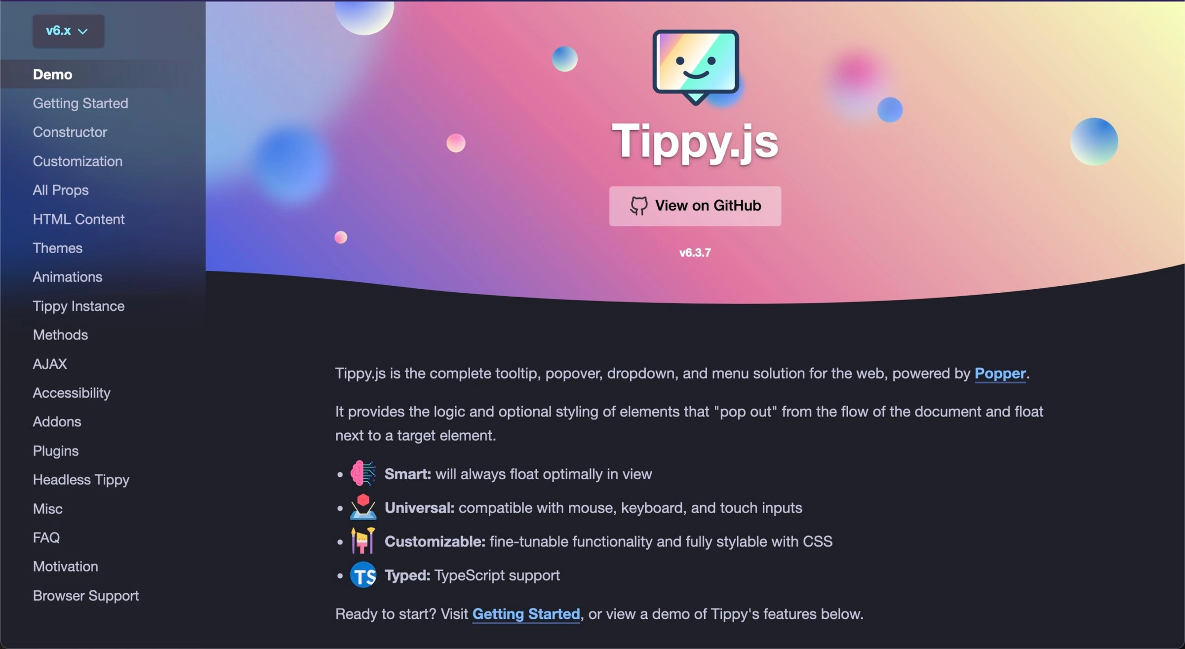
A common use case for Vue.js plugins is wrapping vanilla JavaScript libraries in order to provide better Vue support. Let’s use a library called Tippy.js to create a custom Vue.js plugin.
By the end of the tutorial you’ll have a plugin that works something like in this stackblitz project.
Define the Vue.js Plugin
To start, we’ll need to define the plugin. This can either be an object with an install method or simply a function that runs to install the plugin with the Vue app.
// ToolTipPlugin/index.ts
import type { App } from "vue"

export const toolTipPlugin = (app: App)=>{
  console.log("installing tooltip plugin")
}
Register the Vue.js Plugin
Next, in order to register the plugin it should be “used” by the Vue application.
// main.ts
//...
import { toolTipPlugin } from "./toolTipPlugin";

createApp(App)
  .use(toolTipPlugin) // ⬅️ "use" the plugin
  .mount("#app");
Register a Global Component from Within the Vue.js Plugin
Let’s say that we want the plugin to support a <ToolTip/> component that can be nested inside any element. Then whenever that parent element is hovered over, the tooltip will show like this:
// App.vue
<span>
  Hover Over Me
  <ToolTip text="Hello world!"/>
</span>
We can create this as a single file component and then register it via the plugin.
//ToolTipPlugin/ToolTip.vue
<template>
    <div>My tooltip plugin</div>
</template>
// ToolTipPlugin/index.ts
import type { App } from "vue"
import ToolTip from "./ToolTip.vue"
export const toolTipPlugin = (app)=>{
app.component("ToolTip", ToolTip) // ⬅️ register the component here
}If it isn’t necessary to render the component immediately on page load, you could also import it asynchronously to ensure it’s only included whenever the component is actually being used. This works great for a tooltip plugin that is only relevant after the user has started interacting with certain elements.
// ToolTipPlugin/index.ts
import type { App } from "vue"
import { defineAsyncComponent } from "vue";
import ToolTip from "./ToolTip.vue"

export const toolTipPlugin = (app)=>{
  app.component(
      "ToolTip",
      defineAsyncComponent(() => import("./ToolTip.vue"))
    );
}
Create the ToolTip Vue Component
As of now, the component shows on the page but does not have the tooltip like functionality. It’s just printing the static “My tooltip plugin” text.
Let’s use Tippy.js now inside the component to get the ToolTip functionality we’re looking for.
//ToolTipPlugin/ToolTip.vue
<script setup>
import tippy from "tippy.js";
import "tippy.js/dist/tippy.css";
import { onMounted, ref, onUpdated, onUnmounted, inject } from "vue";

// accept the text prop so message can be customized
const props = defineProps({
  text: { type: String, required: true },
});

// a template ref to get the span DOM element in the template
const tooltip = ref(null);

// tippyInstance used for destroying if it already exists before create a new one
let tippyInstance = null;

// initialize tippy on the proper element with the proper content
function initTippy() {
  // if tippy tooltip already exists destroy it before creating another
  if (tippyInstance) tippyInstance.destroy();

  // the tippy function takes the element to hover over and some options
  // remember we want the element the tooltip is nested under
  // we can access that on the template ref's parentNode
  tippyInstance = tippy(tooltip.value.parentNode, {
    content: props.text,
  });
}

// we should initialize tippy on mounted so that it works on app load
onMounted(initTippy);

// but we should also initialize it again on update
// so that the tooltip text is reactive
onUpdated(initTippy);

// Finally we should clean up things and prevent memory leaks by destorying
// tippy whenever the component is unmounted
onUnmounted(() => tippyInstance.destroy());
</script>
<template>
  <span ref="tooltip"></span>
</template>
Make the Component Flexible by Supporting Tippy.js Options
In order to make our plugin just as flexible as the original vanilla library, it would be nice for our component to accept all the options that Tippy.js supports. We can do that by creating a prop for each of the different Tippy.js options or creating an options prop that accepts an options object.
I’ll go with the later as it’s quicker to implement for this demo.
//ToolTipPlugin/ToolTip.vue
<script setup>
const props = defineProps({
  // ...
  options: { // ⬅️ define options as a prop
    type: Object,
    default() {
      return {}; // ⬅️ default it to an empty object
    },
  },
});

// ...

function initTippy() {
  //...
  tippyInstance = tippy(tooltip.value.parentNode, {
    content: props.text,
    ...props.options, // ⬅️ spread the options into tippy's options
  });
}
</script>
Then we could use it like this.
<span>
  Hover Over Me
  <ToolTip :text="tooltipText" :options="{ placement: 'bottom' }"/>
</span>
Support Vue.js Plugin Level Options
We can take this flexibility one step further by allowing the users of the plugin to define these options once at the plugin level and have them apply to all the tool tip instances throughout the app.
// main.ts
//...
import { toolTipPlugin } from "./toolTipPlugin";

createApp(App)
  .use(toolTipPlugin, {
    placement: "bottom" // ⬅️ define Tippy options at the plugin level
  })
  .mount("#app");
Accomplishing this will take a couple different steps.
First, we’ll need to access the plugin options with the second argument our plugin install function.
// ToolTipPlugin/index.ts
import type { App } from "vue"

// options available as second option ↘️
export const toolTipPlugin = (app: App, options)=>{
  //...
}
Next, we need a way to pass these options down to the ToolTip component where the call to the tippy function exists.
?♀️ Provide/inject to the rescue!
// ToolTipPlugin/index.ts
//...

// ⬇️ create inject key as a symbol to ensure uniqueness
export const tooltipOptionsInject = Symbol();
export const toolTipPlugin = (app: App, options)=>{
    // ⬇️ provide options to all components of the app (including <ToolTip>)
  app.provide(tooltipOptionsInject, options);
  //...
}
//ToolTipPlugin/ToolTip.vue
// ⬇️ import the unique key from the main plugin file
import { tooltipOptionsInject } from "./";
// ...
tippy(tooltip.value.parentNode, {
...inject(tooltipOptionsInject), // ⬅️ spread injected options to tippy
content: props.text,
...props.options,
});Notice, the placement of these options at the top of the tippy options object. This is intentional. This makes them a lower priority than the options provided at the component level with the options prop.
Support Vue.js Plugin Option Defaults
Oftentimes you'll want to provide defaults for your plugin options. And while it's not as necessary in this case, since tippy already provides its own defaults, let me show you how to do it for your other future plugins.
A simple solution is as easy as spreading the provided options into an object right along defaults.
// ToolTipPlugin/index.ts

export const toolTipPlugin = (app: App, options)=>{
  options = {
    placement: "left",
    ...options // ⬅️ make sure user provided options are spread last
  }
}
A more robust solution that would merge deeply nested options can be handled with a library like defu.
npm install defu// ToolTipPlugin/index.ts
import { defu } from 'defu'
export const toolTipPlugin = (app: App, options)=>{
options = defu(options, {
placement: "left",
});
}
Make Vue.js Plugin Options Type Safe with TypeScript
To provide the best experience for those who will use your plugin, it’s nice to type the plugin’s options. This provides robust error detection for options that don’t exist or that are configured improperly. It also makes discovering the available options a breeze as they are autocompleted within the developers IDE.
This requires us to export a createToolTipPlugin function that accepts the typed options and returns the install function. This is the same approach used by other popular Vue 3 plugins including Vue Router.
// ToolTipPlugin/index.ts
import type { Props } from "tippy.js";
//...

// ⬇️ options can be manually typed
// or in this case just reused from tippy
type PluginOptions = Partial<Props>;

// ⬇️ export the create function instead of the install function
export function createToolTipPlugin(options: PluginOptions) {
  return (app) => {
    // ... the meat of the plugin
  };
}
This also means where the plugin is being used would have to be refactored slightly.
// main.ts
// ⬇️ import the create function
import { createToolTipPlugin } from "./toolTipPlugin";
import "./assets/main.css";
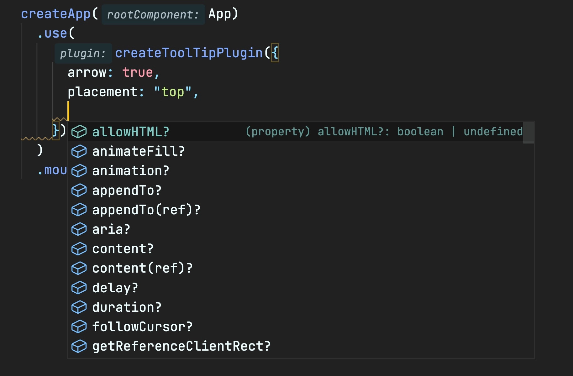
createApp(App)
.use(
createToolTipPlugin({ // ⬅️ pass the opts to function instead of .use
arrow: true,
placement: "top",
})
)
.mount("#app");Conclusion
And there you have it! Now you’ve got a working tooltip plugin you can use over and over again!
If you’d like a more in depth explanation of Vue.js plugins and more info on how to create this same ToolTip plugin checkout our course: Custom Vue.js 3 Plugins. Besides the info shared here we’ll also dig deeper and include topics like distributing the plugin on npm.
Start learning Vue.js for free

Comments
Latest Vue School Articles

Just Released: Nuxt Hub Multi-Vendor and First-Class DB

Vue.js – 2025 In Review and a Peek into 2026
Our goal is to be the number one source of Vue.js knowledge for all skill levels. We offer the knowledge of our industry leaders through awesome video courses for a ridiculously low price.
More than 200.000 users have already joined us. You are welcome too!
© All rights reserved. Made with ❤️ by BitterBrains, Inc.